This site uses cookies to improve your experience. To help us insure we adhere to various privacy regulations, please select your country/region of residence. If you do not select a country, we will assume you are from the United States. Select your Cookie Settings or view our Privacy Policy and Terms of Use.
Cookie Settings
Cookies and similar technologies are used on this website for proper function of the website, for tracking performance analytics and for marketing purposes. We and some of our third-party providers may use cookie data for various purposes. Please review the cookie settings below and choose your preference.
Used for the proper function of the website
Used for monitoring website traffic and interactions
Cookie Settings
Cookies and similar technologies are used on this website for proper function of the website, for tracking performance analytics and for marketing purposes. We and some of our third-party providers may use cookie data for various purposes. Please review the cookie settings below and choose your preference.
Strictly Necessary: Used for the proper function of the website
Performance/Analytics: Used for monitoring website traffic and interactions
Why Should I Care About Smart Visualization and Advanced Data Discovery? Are you up on the latest analytics lingo or do you still think smart visualization is some kind of artificial eyeball? Smart Visualization takes the handcuffs off users and eliminates the need for the enterprise to anticipate exactly what each user needs.
Why Should I Care About Smart Visualization and Advanced Data Discovery? Are you up on the latest analytics lingo or do you still think smart visualization is some kind of artificial eyeball? Smart Visualization takes the handcuffs off users and eliminates the need for the enterprise to anticipate exactly what each user needs.
Why Should I Care About Smart Visualization and Advanced Data Discovery? Are you up on the latest analytics lingo or do you still think smart visualization is some kind of artificial eyeball? Smart Visualization takes the handcuffs off users and eliminates the need for the enterprise to anticipate exactly what each user needs.
If you are considering a Business Intelligence solution, you ought to give some consideration to the concept of Smart Data Visualization and review your prospective solution to determine its capabilities in that regard. How do users perceive and use data? How do formats and reporting affect a user’s understanding of data?
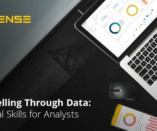
Tracking is an essential step in your user onboarding process and allows you to evaluate how efficient your user onboarding strategy is. Here, the main idea is to assess your overall userexperience and targeting. Create visualizations and reports. Visualizations are easier to process for our brains.
AI apps can gather data by analyzing user behavior and interaction. Additionally, AI can enhance the functionality and userexperience of AR apps. Monitoringuser behavior and tracking app performance is crucial for continuous improvement. However, AI isn’t just useful within the app itself.
You can monitor the delivery and reception of your emails, which helps your team assess the performance of each campaign and connect with potential customers. Automate the scheduling and monitoring of sales calls. Visual appearance : The best sales automation tools are only as good as the graphics and design that they utilize.
If you are considering a Business Intelligence solution, you ought to give some consideration to the concept of Smart Data Visualization and review your prospective solution to determine its capabilities in that regard. How do users perceive and use data? How do formats and reporting affect a user’s understanding of data?
If you are considering a Business Intelligence solution, you ought to give some consideration to the concept of Smart Data Visualization and review your prospective solution to determine its capabilities in that regard. How do users perceive and use data? How do formats and reporting affect a user’s understanding of data?
The Toolbox is where we talk development best practices, tips, tricks, and success stories to help you build the future of analytics and empower your users with the insights and actions they need. JavaScript data visualization tools are in greater demand now than ever before because of the enormous growth of data.
The platform’s flexible and customizable dashboards give users more control over their experience, allowing them to leverage data-driven insights and visual tools, such as heatmaps, to optimize decision-making and improve overall business operations.
“By visualizing information, we turn it into a landscape that you can explore with your eyes. 90% of the information transmitted to the brain is visual. Data visualization methods refer to the creation of graphical representations of information. That’s where data visualization comes in. A sort of information map.
You will want a variety of tools and sophisticated features and functionality in an easy-to-use environment to support and transform your business users into Citizen Data Scientists. It is important to provide flexible tools that allow users to personalize dashboards, monitor, analyze and present data.
Tableau launched Ask Data in 2019 to lower the barrier to entry for analytics and enable more people to experience the power of data exploration. Ask Data uses a keyword-based system to map user intent to analytical query and visualization. In 2020, Metrics in Tableau launched.
The one-page dashboard was once the predominant form of visualizing data. With touch screens, mobile devices, on-demand data, and interfaces crafted for interaction and userexperience, the one-page dashboard is a relic. These interaction models have elongated what userexperience designers consider a single screen.
Application Programming Interface (API) monitoring tools are essential software solutions designed to closely monitor API performance, availability, and security. These monitoring tools are essential for ensuring APIs remain available and reliable for users. Why Do Businesses Need API Monitoring Tools?
This scenario is where API monitoring steps in. An important part of API management , monitoring API metrics allows organizations to detect issues rapidly and optimize their API performance. What is API Monitoring? API monitoring allows to: Detect performance issues before they impact users.
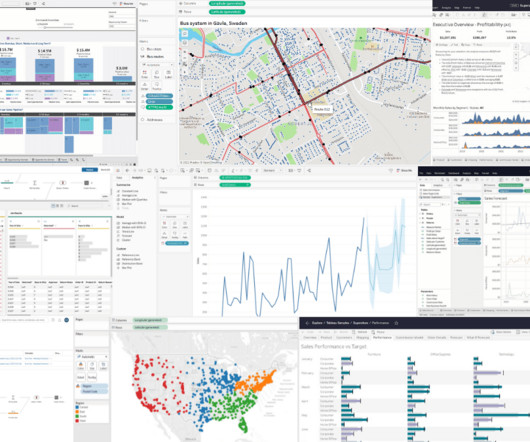
Click to view the full interactive visualization. VizQL: A domain-specific language for visual, self-service analysis. The core innovation in Chris’ prototype was a domain-specific language called VizQL that combined query and visual encoding of data. The Cycle of Visual Analysis. Release v1.0
This will help you structure the tool effectively and provide a seamless userexperience. Invest in clear and visually appealing design elements that align with your brand identity. Structure the tool in a logical manner, making it easy for users to navigate and find the information they need.
You will want a variety of tools and sophisticated features and functionality in an easy-to-use environment to support and transform your business users into Citizen Data Scientists. It is important to provide flexible tools that allow users to personalize dashboards, monitor, analyze and present data.
Kuber Sharma Director, Product Marketing, Tableau Kristin Adderson August 22, 2023 - 12:11am August 22, 2023 Whether you're a novice data analyst exploring the possibilities of Tableau or a leader with years of experience using VizQL to gain advanced insights—this is your list of key Tableau features you should know, from A to Z.
Now powered by Tableau, Genie brings that trusted, up-to-the-moment customer data to life by layering on visual, explorable, and actionable analytics and insights. . Think of Tableau as your data visualization and business intelligence layer on top of Genie—allowing you to see, understand, and act on your live customer data.
Now powered by Tableau, Genie brings that trusted, up-to-the-moment customer data to life by layering on visual, explorable, and actionable analytics and insights. . Think of Tableau as your data visualization and business intelligence layer on top of Genie—allowing you to see, understand, and act on your live customer data.
By leveraging AI technologies, businesses can enhance userexperiences, optimize operational efficiencies, and drive innovation. Key Areas of AI Integration Personalization and UserExperience (UX) Content Recommendations: AI algorithms analyze user behavior and preferences to provide personalized content suggestions.
Click to view the full interactive visualization. VizQL: A domain-specific language for visual, self-service analysis. The core innovation in Chris’ prototype was a domain-specific language called VizQL that combined query and visual encoding of data. The Cycle of Visual Analysis. Release v1.0
Low-code platforms typically use drag-and-drop features, automatic code generation, business process maps, and other visual tools to deliver an agile development environment without requiring the time or complexity of traditional coding methods. Visual based design. Excellent user interface. Better userexperience.
The adoption of cloud computing, IoT devices, and edge technologies has further intensified IT environment complexity, rendering conventional monitoring and troubleshooting methods insufficient. Enter ZIF DX+, a revolutionary Digital ExperienceMonitoring platform designed to proactively address these challenges.
It will also allow you to properly monitor, manage, and review the implementation of your ideas as you travel across the roadmap. The customer perspective is concerned with the value of the strategy for your customers, from product quality and userexperience to wider values such as sustainability. Here is her LinkedIn.
Exciting and futuristic, the concept of computer vision is based on computing devices or programs gaining the ability to extract detailed information from visual images. Visual analytics: Around three million images are uploaded to social media every single day. Artificial Intelligence (AI).
Today, there are online data visualization tools that make it easy and fast to build powerful market-centric research dashboards. On a typical market research results example, you can interact with valuable trends, gain an insight into consumer behavior, and visualizations that will empower you to conduct effective competitor analysis.
ZIF Dx+ (Zero Incident Framework Digital Xperience) addresses this need by offering an advanced solution for monitoring and optimizing digital experiences within Digital Experience Analytics. This proactive strategy allows businesses to sustain high operational efficiency and user satisfaction.
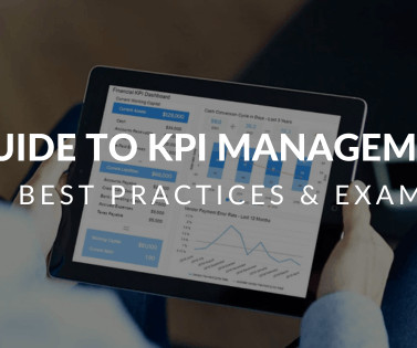
Catchy headlines, backlinks to relevant influencer content, the seamless placement of a numbered or bulleted and visuals are some of the key drivers of successful digital content. KPI management is the process of selecting, monitoring, and analyzing specific industry key performance indicators (or KPIs). What Is KPI Management?
It should be simple to assign work and monitor task progress while also tracking resource capacity and capability. The ability to securely share customer data across a digital ecosystem provides the seamless userexperience customers expect. Automations to streamline mundane or repetitive tasks.
Dashboards are important tools for businesses in an environment where data is used to monitor and track operational or business performance because they give a detailed view of important metrics and performance indicators. Operational Dashboard These are real-time dashboards that are used to monitor processes and systems.
Within that staggering statistic, approximately 15 million Americans live with a visual disability. As you can imagine, this is a huge hurdle in access to the web, as it’s a largely visual medium. Investing in the creation of accessible and inclusive experience should ultimately result in positive ROI for your business.
Early-stage prototypes are shared with stakeholders and users for feedback and validation. UserExperience Design and Testing: Userexperience (UX) design is a critical aspect of the product management process. Product managers collaborate with UX designers to create intuitive and user-friendly interfaces.
While your keyboard is burning and your fingers try to keep up with your brain and comprehend all the data you’re writing about, using an interactive online data visualization tool to set specific time parameters or goals you’ve been tracking can bring a lot of saved time and, consequently, a lot of saved money. Regularly monitor your data.
Consolidating into one integrated tool for prep, analysis, and visualization gives you and your team more functionality all in one place. You can eliminate the frustration that you and your usersexperience when working across multiple and disconnected tools. The combinations are endless, That’s what’s so great about SQL.
Data Cloud for Tableau brings that trusted, up-to-the-moment customer data to life by layering on visual, explorable, and actionable analytics and insights. Think of Tableau as your data visualization and business intelligence layer on top of Data Cloud—allowing you to see, understand, and act on your live customer data.
Low code platforms do this by offering a robust visual development environment where developers can define the user interface using drag and drop functionality, adding actions, animations, and much more. App components using the platform can simply be dragged onto a work surface and connected visually.
With this interactive data visualization tool, sales professionals can monitor and analyze their most important metrics in a matter of minutes. Every hour a salesperson spends cobbling together CRM data is an hour they could have spent searching for leads or communicating with prospective customers.
In 2022, Fluxx decided to find a tool that would embed directly into its platform, matching the look and feel of Fluxx without interrupting the userexperience. Fluxx used Domo Everywhere to build a new, add-on solution called ‘Grantelligence’ that the company sells to users of its core product, creating a new revenue stream.
But there are a few simple steps you can take to improve your end-users’ experience. How to Design Better Dashboards: A Visual Guide. This fun, visual infographic post drives home the dos and don’ts of great dashboards by walking you through one that’s poorly designed and one that’s optimized for readability.
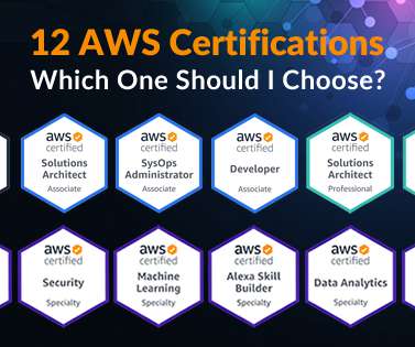
Monitoring and Troubleshooting – 12%. Defining and deploying metrics, monitoring, and logging systems on AWS platform. Monitoring and Logging – 15%. Working with network technologies related to AWS; understanding and monitoring metrics on AWS. Logging and monitoring – 20%. Domains Covered.
We organize all of the trending information in your field so you don't have to. Join 57,000+ users and stay up to date on the latest articles your peers are reading.
You know about us, now we want to get to know you!
Let's personalize your content
Let's get even more personalized
We recognize your account from another site in our network, please click 'Send Email' below to continue with verifying your account and setting a password.


Let's personalize your content