This site uses cookies to improve your experience. To help us insure we adhere to various privacy regulations, please select your country/region of residence. If you do not select a country, we will assume you are from the United States. Select your Cookie Settings or view our Privacy Policy and Terms of Use.
Cookie Settings
Cookies and similar technologies are used on this website for proper function of the website, for tracking performance analytics and for marketing purposes. We and some of our third-party providers may use cookie data for various purposes. Please review the cookie settings below and choose your preference.
Used for the proper function of the website
Used for monitoring website traffic and interactions
Cookie Settings
Cookies and similar technologies are used on this website for proper function of the website, for tracking performance analytics and for marketing purposes. We and some of our third-party providers may use cookie data for various purposes. Please review the cookie settings below and choose your preference.
Strictly Necessary: Used for the proper function of the website
Performance/Analytics: Used for monitoring website traffic and interactions
BI software provides businesses with the opportunity to aggregate and organize data into compatible formats and then present data using a varied range of data reports, charts and graphs. This helps data analysts to understand the relations between business entities and create meaningful links to perform data analytics.
As your business moves toward metrics and measurable results and embraces analytics, it is likely to consider the implementation of augmented analytics across the enterprise. And, when it comes to the presentation of data, users will want new and improved ways to tell the story. What is Smart Data Visualization?
As your business moves toward metrics and measurable results and embraces analytics, it is likely to consider the implementation of augmented analytics across the enterprise. And, when it comes to the presentation of data, users will want new and improved ways to tell the story. What is Smart Data Visualization?
As your business moves toward metrics and measurable results and embraces analytics, it is likely to consider the implementation of augmented analytics across the enterprise. And, when it comes to the presentation of data, users will want new and improved ways to tell the story. What is Smart Data Visualization?
One of the most powerful ways for your organization to get a competitive edge is to embed analytics, because it enables you to go beyond improving internal efficiencies with data. Embeddedanalytics are often the centerpiece of such applications and services, and. Current analytics solutions aren’t user-friendly.
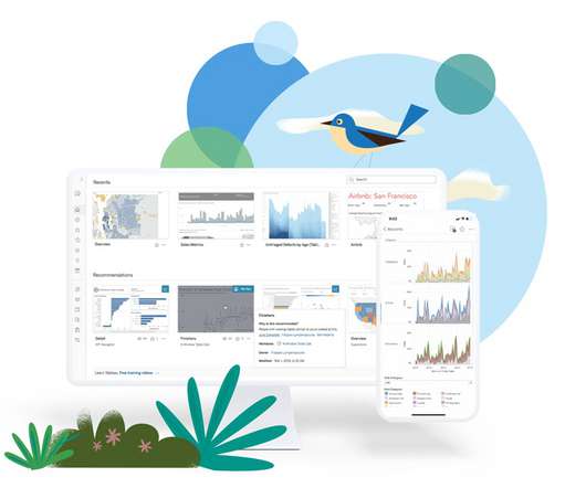
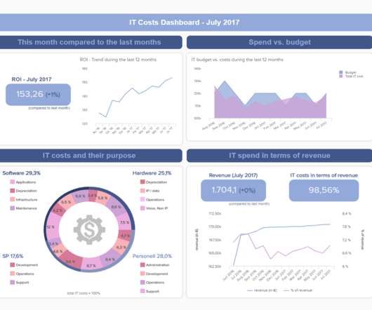
A BI dashboard — or business intelligence dashboard — is an information management tool that uses data visualization to display KPIs (key performance indicators) tracked by a business to assess various aspects of performance. And when the data is presented in a visually comprehensible manner, it becomes easier for informed decision making.
A BI dashboard — or business intelligence dashboard — is an information management tool that uses data visualization to display KPIs (key performance indicators) tracked by a business to assess various aspects of performance. And when the data is presented in a visually comprehensible manner, it becomes easier for informed decision making.
Look for sessions on the Tableau Exchange , the Tableau Developer Platform , and EmbeddedAnalytics. . Theme: Analytics for everyone. Session: From Data to Dashboard: Key Features for Analytical Success. Presenter: Darin Bergeson . Theme: Customer 360 analytics. Presenters: Karen Madera, Shiva Kavindapi .
Spreadsheets finally took a backseat to actionable and insightful data visualizations and interactive business dashboards. The rise of self-service analytics democratized the data product chain. Suddenly advanced analytics wasn’t just for the analysts. The trends we presented last year will continue to play out through 2020.
If your application doesn’t already deliver embedded insights, then you’re not just missing out on an opportunity to delight customers and create additional revenue and growth for your company, you’re putting your company’s continued success at risk. Building beyond basic embedding. Choose your own embedded NLQ design strategy.
Now, enhanced integration with two heavy-hitter Adobe Creative Cloud programs, XD and Photoshop, takes your ability to create and deploy custom visuals to new heights. It’s not just enough for your app to employ data and analytics in interesting, compelling ways, it also needs to look great. App design (visual style, UI, UX, etc.)
To gain visibility into visualization load times, user actions, number of views, and more, Advanced Management includes multiple operational insight features. Figure 2: With Admin Insights, administrators can drive adoption with greater insight into visualization performance, user actions, and more. . EmbeddedAnalytics.
To gain visibility into visualization load times, user actions, number of views, and more, Advanced Management includes multiple operational insight features. Figure 2: With Admin Insights, administrators can drive adoption with greater insight into visualization performance, user actions, and more. . EmbeddedAnalytics.
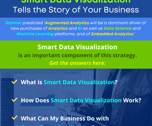
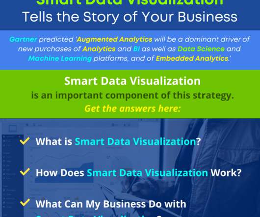
In its report entitled, ‘Augmented Analytics Is the Future of Data and Analytics’, published on October 31, 2018, Gartner provided the following strategic planning assumption: ‘By 2020, augmented analytics will be a dominant driver of new purchases of analytics and BI as well as data science and machine learning platforms, and of embeddedanalytics.’
In its report entitled, ‘Augmented Analytics Is the Future of Data and Analytics’, published on October 31, 2018, Gartner provided the following strategic planning assumption: ‘By 2020, augmented analytics will be a dominant driver of new purchases of analytics and BI as well as data science and machine learning platforms, and of embeddedanalytics.’
Machine learning takes the heavy lifting away from business users and allows them to leverage their core business knowledge and skills to engage in predictive analytics, while allowing the flexibility and sophistication of machine learning to offer the guided assistance of a ‘smart’ solution.
Sharon Liao Senior Product Manager, Tableau Bronwen Boyd March 30, 2023 - 5:29am April 4, 2023 As companies increasingly rely on data analytics to make informed decisions and gain a competitive edge, the challenge of presenting relevant and secure data to end users has become even more critical.
The world of data visualization is constantly evolving. If you’re reading this, it’s likely for one of two reasons: You need a visualization library for your project, or you’re curious about what’s changed since 2020 in terms of visualization libraries. Data visualizations are a vital part of embeddedanalytics.
SILICON SLOPES, Utah — Today Domo (Nasdaq: DOMO) announced it has been named to the Q3 2024 Constellation ShortList for Multicloud Analytics and Business Intelligence Platforms and the Q3 2024 Constellation ShortList for Marketing Analytics Solutions for the ninth consecutive year.
Look for sessions on the Tableau Exchange , the Tableau Developer Platform , and EmbeddedAnalytics. . Theme: Analytics for everyone. Session: From Data to Dashboard: Key Features for Analytical Success. Presenter: Darin Bergeson . Theme: Customer 360 analytics. Presenters: Karen Madera, Shiva Kavindapi .
The smart ones are finding new ways to monetize their data, either by embeddinganalytics into apps and services that existing users will pay for or using them to grow their audience and expand into new markets. As you’d expect from the section above, LinkedIn is a heavy collector and presenter of data.
A BI dashboard — or business intelligence dashboard — is an information management tool that uses data visualization to display KPIs (key performance indicators) tracked by a business to assess various aspects of performance. And when the data is presented in a visually comprehensible manner, it becomes easier for informed decision making.
A BI dashboard — or business intelligence dashboard — is an information management tool that uses data visualization to display KPIs (key performance indicators) tracked by a business to assess various aspects of performance. And when the data is presented in a visually comprehensible manner, it becomes easier for informed decision making.
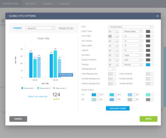
The provider’s analytics platform plugs into your data source, crunches your numbers, and then generates reports and dashboard data visualizations. The right platform will give you total control over the widgets in your data visualizations, ideally in a user-friendly UI editor (like in Sisense’s Embedded Playground ).
Tools of the Trade is your destination for data and analytics skill building: From dashboards and reports to embeddinganalytics and building custom analytic apps to SQL secrets and data deep-dives, whatever you need to know to be better at your job, you can find it here. How you embed analytics into your apps matters.
Today agencies should focus on driving valuable insights from their data and presenting them in an understandable way for stakeholders to see; in other words, crowded excel sheets or infinite PowerPoint presentations are no longer enough. This is where modern agency reports come into the picture. Social media agency dashboard.
An exciting slate of presentations took them on a journey from why to how they should use data analytics to optimize their operations successfully and maximize their business opportunities. We really liked Scott’s story of the development of BI and Big Data and the vision he presented. A true unicorn.
Product, technology, and R&D professionals are always keen to discuss how software companies are driving product innovation and new revenue streams through embeddedanalytics. See our free analyst report on next-generation embedded custom analytics. “The potential for apps that embed analytics is limitless.
b) Analytics Features. For a few years now, Business Intelligence (BI) has helped companies to collect, analyze, monitor, and present their data in an efficient way to extract actionable insights that will ensure sustainable growth. Table of Contents. 1) Benefits Of Business Intelligence Software. a) Data Connectors Features.
Sharon Liao Senior Product Manager, Tableau Bronwen Boyd March 30, 2023 - 5:29am April 4, 2023 As companies increasingly rely on data analytics to make informed decisions and gain a competitive edge, the challenge of presenting relevant and secure data to end users has become even more critical.
No longer passive consumers of information, you become master storytellers, captivating audiences with visual masterpieces crafted from data. This isn’t just a new product; it’s a complete reimagining of our embeddedanalytics offering.
Tools of the Trade is your destination for data and analytics skill building: From dashboards and reports to embeddinganalytics and building custom analytic apps to SQL secrets and data deep-dives, whatever you need to know to be better at your job, you can find it here. How to Design Better Dashboards: A Visual Guide.
A strong data team, coupled with an advanced analytics platform, enables you to deepen your data exploration as you scale your business and anticipate the increasing complexity that comes with growth. Data teams deliver fast, accurate business reporting, BI, and data visualizations via SQL-based tools.
Your Salesforce instance includes analytics and dashboards, but only for Salesforce data — don’t settle for that! When looking at customer data in Salesforce, augment it with a more holistic view of data about your product to visualize everything all in one place.
These common self-service capabilities may affect your business intelligence requirements: User personas: Increase the adoption of analytics by providing a broad range of users with a tailored experience that matches their needs and skills. User experience: Many analytic applications need to be white-labeled to match your brand.
To business intelligence execs, the top-level view is the integration of everything from containers to ML technologies and visualizations. Analytics must cope with both structured and unstructured data to achieve optimal results. Turning data into actionable insights is where BI and data analytics platforms like Sisense shine.
Presently, these solutions combine public health and technological disciplines to achieve high-level health outcomes for broader populations. A compelling example of this practice was also employed within a network of state clinics.
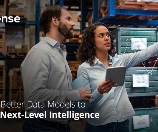
Whatever you are looking to do with your analytics platform, it’s important that you choose a tool that can connect to all your data sources and help you prepare data models that will support your needs. The right data model + artificial intelligence = augmented analytics. Dig into AI. displaying BI insights for human users).
A traditional report is typically static data presented in tabular or text format with basic graphs and charts. An analytic application, on the other hand, displays key performance indicators (KPIs) that enable active monitoring of performance, efficiency, or other business metrics and actions.
However, beyond these nuts-and-bolts elements, you also need to consider features that impact how your brand presents itself to users. Brand-related features may even be the most important criteria when choosing a platform like Sisense to enhance your analytic app. The power of branding. Cool stuff!”.
Before we dive into the topics of big data as a service and analytics applied to same, let’s quickly clarify data analytics using an oft-used application of analytics: Visualization! For starters, the rise of the Internet of Things (IoT) has created immense volumes of new data to be analyzed.
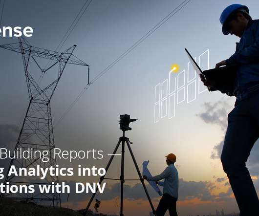
This process necessitated us getting a handle on the data we were already collecting, making sense of the constant stream of new information our clients were pulling in, and presenting it all in an easy-to-understand interface. Unique challenges and opportunities in the utilities industry.
So what’s the best way to present your platform to customers? Should you be marketing your analytic app as a product or a service? A visualization that clearly shows how a user’s KPIs compare to the industry as a whole can be a powerful tool in your arsenal. Performing at your best is amazing, but what about being THE best? (In
Embrace embeddedanalytics, make better data-driven decisions. For anyone creating their organization’s digital transformation strategy, much of their focus is typically devoted to gathering, managing, analyzing, and visualizing data. With embeddedanalytics at their fingertips, everyone can make data-driven decisions.
We organize all of the trending information in your field so you don't have to. Join 57,000+ users and stay up to date on the latest articles your peers are reading.
You know about us, now we want to get to know you!
Let's personalize your content
Let's get even more personalized
We recognize your account from another site in our network, please click 'Send Email' below to continue with verifying your account and setting a password.


Let's personalize your content