This site uses cookies to improve your experience. To help us insure we adhere to various privacy regulations, please select your country/region of residence. If you do not select a country, we will assume you are from the United States. Select your Cookie Settings or view our Privacy Policy and Terms of Use.
Cookie Settings
Cookies and similar technologies are used on this website for proper function of the website, for tracking performance analytics and for marketing purposes. We and some of our third-party providers may use cookie data for various purposes. Please review the cookie settings below and choose your preference.
Used for the proper function of the website
Used for monitoring website traffic and interactions
Cookie Settings
Cookies and similar technologies are used on this website for proper function of the website, for tracking performance analytics and for marketing purposes. We and some of our third-party providers may use cookie data for various purposes. Please review the cookie settings below and choose your preference.
Strictly Necessary: Used for the proper function of the website
Performance/Analytics: Used for monitoring website traffic and interactions
CHARLESMINGUS Overview The appeal of visualization is rooted in biology. The brain simply processes images better than words, devoting more than half its processing power to this task; the human eye tends to seek out and focus on visual stimuli that are easy to recognize including color, shapes, and patterns. Thats creativity.
Learn how DirectX visualization can improve your study and assessment of different trading instruments for maximum productivity and profitability. Let’s dive right into how DirectX visualization can boost analytics and facilitate testing for you as an Algo-trader, quant fund manager, etc. But first, What is DirectX Anyway?
As data sets become bigger, it becomes harder to visualize information. Data visualization enables you to: Make sense of the distributional characteristics of variables Easily identify data entry issues Choose suitable variables for data analysis Assess the outcome of predictive models Communicate the results to those interested.
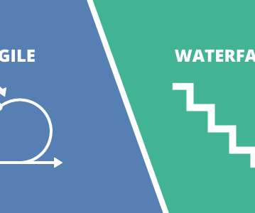
The merits of Agile versus Waterfall are well documented. This article attempts to provide a visual, relative comparison between: A traditional Waterfall method that […].
The ability to extract key data points from a document accurately and timely is invaluable for businesses as decision-making depends on it. In a bid to enhance their existing document management and processing workflows, business and data leaders often engage in the OCR vs. IDP debate. IDP stands for intelligent document processing.
In the previous post , I spoke about documenting user story acceptance criteria using text. In this article, I want to speak about more visual formats for spelling out requirements and acceptance criteria. Overall, we are talking about a full day of work spent on documenting requirements. Then, an idea came to me.
On Saturday, 9th June 2018, we announced the existence of Power BI Documenter. As the name resembles, Power BI Documenter is a tool to help individuals and businesses to document their Power BI Desktop models. The post What is Power BI Documenter appeared first on BI Insight.
E-signatures, or the digitized or scanned version of handwritten signatures, improve business processes, allowing fast signing and approval of documents. They are used to verify digital documents and messages. An AI possesses qualities that include visual perception and tactile intelligence, which help advance e-signatures.
In fact, lawyers deal with tens, if not hundreds, of documents on a daily basis during most parts of their job, such as discovery, research, or drafting. Someone who memorizes all the legal documents they read and can offer relevant insights when prompted. Let's discuss your document processing. Make that paper work !
k-means Clustering – Document clustering, Data mining. Besides data mining, this tool is in-demand in the following fields: Market segmentation; Document clustering; Image segmentation; Pattern recognition; Insurance fraud detection and others. As a visualization tool – PCA is great at showing a bird’s view of the process.
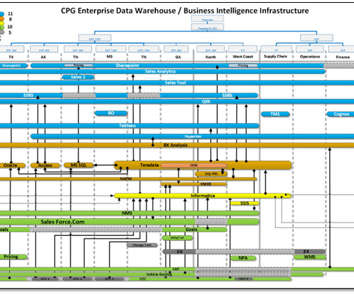
More importantly, we need to consider an alternative way of thinking Manuel Lima , Visual ComplexityMapping Patterns of Information Making Program Management More Challenging Program management is inherently difficult but becomes even more challenging when confronted with ineffective program modeling, performance monitoring, or reporting.
Nowadays, terms like ‘Data Analytics,’ ‘Data Visualization,’ and ‘Big Data’ have become quite popular. Some prominent banking institutions have gone the extra mile and introduced software to analyze every document while recording any crucial information that these documents may carry.
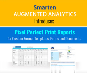
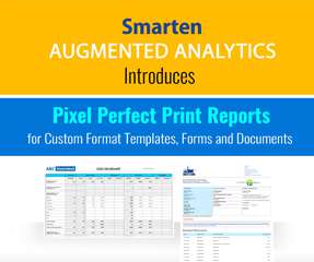
This customized print report environment will provide more flexibility for businesses to create forms, reports and documents that meet the unique needs of users, customers and other stakeholders.” With Pixel Perfect Print Reports, our Smarten clients can optimize productivity and easily create forms and documents,” says Patel.
This customized print report environment will provide more flexibility for businesses to create forms, reports and documents that meet the unique needs of users, customers and other stakeholders.”. With Pixel Perfect Print Reports, our Smarten clients can optimize productivity and easily create forms and documents,” says Patel.
Once your documents are up on the platform, you’re ready to go. Additionally, Trullion offers visual, intuitive, and straightforward dashboard functionalities to ease their daily tasks and reports. Visual Lease. Image source: Visual Lease. It can even detect asset-related Excel data. Image source: Trullion.
Such API interactions should be appropriately defined and documented for a Client, requiring several API calls with some additional actions. As a product owner or business analyst, you can either (1) provide documentation for a Client describing a workflow of API calls or (2) define internal logic for API calls under BFF/APIGateway.
Here are some book recommendations covering everything from the product process and discovery interviews to problem framing and documentation. The output is a visual representation of work to be done, which then allows us to plan iterations and/or releases, discuss priorities, etc. But these books are not only about techniques.
Video conferencing is likely to become even more integrated with workflows, allowing you to go through visual elements that enhance the meetings and boost productivity. In many ways, employees can work just as productively as they would in the office. Utilization of Chatbots.
JavaScript data visualization tools are in greater demand now than ever before because of the enormous growth of data. Marketing , finance , and sales teams all rely on visualizations to help them understand their data. Understanding Javascript data visualization libraries.
Many industries are starting to realize the true benefits they can get from analyzing and visualizing the many amounts of data is designed today. Law firms tend to have large piles of paper documents. The legal industry always had tremendous data but it always went offline, on paper, in documents, etc.
Effective Data Visualization Techniques In todays data-driven world, the ability to present data clearly and effectively is essential. Data visualization transforms complex data into visual formats like charts, graphs, and dashboards, making it easier to analyze, interpret, and communicate insights.
It includes features like: Month-end reviews to ensure books are closed accurately and on-time A performance center to easily visualize your practice’s productivity Easy integration with Intuit Quickbooks Straightforward systems for recurring transactions and bank feeds. Xero Practice Manager.
Whether this is your first Tableau visualization or your 100th, let this be a chance to practice and grow your viz-building skills using your own personal data! Tableau is a visual analytics platform that empowers all people and organizations to make the most of their data with an easy-to-navigate interface, no coding skills necessary.
Now that you’re sold on the power of data analytics in addition to data-driven BI, it’s time to take your journey a step further by exploring how to effectively communicate vital metrics and insights in a concise, inspiring, and accessible format through the power of visualization. That’s a colossal number of books on visualization.
Imagine you are ready to dive deep into a new project, but amidst the sea of information and tasks, you find yourself at a crossroads: What documents should you create to capture those crucial requirements? The path to success lies in understanding the power of documentation. It defines the scope of the project.
Perform a document analysis of any publicly available document on the domain. Read any existing documentation , meeting notes, or important emails about the project. Having a visual comparison of their products/websites is also very useful. You will have to document and validate the requirements with the stakeholders.
Whether this is your first Tableau visualization or your 100th, let this be a chance to practice and grow your viz-building skills using your own personal data! Tableau is a visual analytics platform that empowers all people and organizations to make the most of their data with an easy-to-navigate interface, no coding skills necessary.
A customer journey map is a visual representation of experiences a customer has with your online store: from the first touch with you to completing the purchase. Now, you can start visualizing your customer journey. The main touchpoints may be a courier service or documents. What is a customer journey map? Actual mapping.
You can use BI to visualize trends, discover patterns and uncover relationships that can improve your decision-making skills at every level of your company. Data digitization involves taking an existing document or dataset and converting it into digital format, typically using optical scanning or data entry.
With e-Discovery legal analytics tools, you can filter documents by data range instead of delving through mountains of documents or focus on only those containing the exact keywords. We’re all acquainted with the stress of having to search through stacks of documents and rows of spreadsheet data to find that number you need.
I don’t know if you are, but I am a very visual person. I have found I even document my personal and professional goals visually and I do that through mind mapping. I have found I even document my personal and professional goals visually and I do that through mind mapping.
Embedded Software Development Tools Software engineers building embedded systems need a variety of tools, from development environments and compilers to debugging tools and documentation. Popular options include Atmel Studio, Eclipse, Visual Studio Code, and Keil MDK.
“By visualizing information, we turn it into a landscape that you can explore with your eyes. 90% of the information transmitted to the brain is visual. Data visualization methods refer to the creation of graphical representations of information. That’s where data visualization comes in. A sort of information map.
Over the years, Snapshot has grown into the industry’s most comprehensive toolset for org management, relational data migration, documentation, technical debt removal, and more. Visualize the problem. What about SAP and Oracle? For those operating under SAP’s CRM platform, the team at Pillir has its own leading solution.
This he’s just one of the many ways that artificial intelligence has significantly improved outcomes that rely on visual media. Improving annotation quality is crucial for various tasks, including data labeling for machine learning models, document categorization, sentiment analysis, and more.
But also because the job of BAs focused on gathering requirements upfront, and writing heavy documents didn’t make any sense anymore. Focus on the problem Every consulted documentation suggests focusing on the problem rather than jumping to a solution. Process modeling may be used to document the “as is” process.
Waste can take many forms, such as redundant features, excessive documentation, misaligned priorities, or inefficient communication. For example, models, or evolving documents. Use value stream mapping to visualize workflows and highlight inefficiencies. user manuals).
Time management simplified Photo by Aron Visuals on Unsplash So far For those of you who have read my articles here so far, I have written on a broad range of business analysis techniques. A physical white board can be used to take down notes to track updates, see a visual overview, etc.
5) The Role Of Visuals In Accountant Reports. This also proves to be a very useful document when it comes to attracting new investors and keeping the ones you already have happy. To do so, however, you need several tools: a good accounting software, but also a solid online data visualization tool. Table of Contents.
For example, some stakeholders may prefer visual aids, while others may prefer written documentation. Communication styles: Communication is essential in agile software development, and understanding different communication styles can improve collaboration and productivity.
They can also use visual data to better conceptualize their tax situations. Fortunately, data analytics makes it easier to address them by quickly reviewing documents before filing. Dealing with Filing Issues. Another headache for businesses is to reduce the filing issues. Taking Care of Audit.
In addition, well-known products boast a lot of implementations and use cases that are comprehensively reflected in the documentation. The steady growth of data volumes collected and stored by businesses has called forth the need for solutions that can visualize the results of processing these data flows.
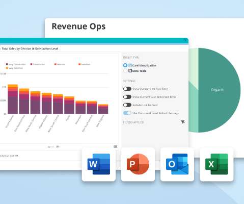
With Office Add-ins, those users don’t ever have to leave Word, Excel, PowerPoint, or Outlook to share real-time visualizations from Domo. Perhaps you’ve created a Word document so you can share weekly metrics with key stakeholders, or you’re getting ready to publish a report for leadership about quarterly performance metrics.
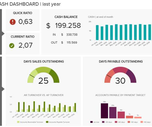
A BI dashboard — or business intelligence dashboard — is an information management tool that uses data visualization to display KPIs (key performance indicators) tracked by a business to assess various aspects of performance. And when the data is presented in a visually comprehensible manner, it becomes easier for informed decision making.
We organize all of the trending information in your field so you don't have to. Join 57,000+ users and stay up to date on the latest articles your peers are reading.
You know about us, now we want to get to know you!
Let's personalize your content
Let's get even more personalized
We recognize your account from another site in our network, please click 'Send Email' below to continue with verifying your account and setting a password.


Let's personalize your content