This site uses cookies to improve your experience. To help us insure we adhere to various privacy regulations, please select your country/region of residence. If you do not select a country, we will assume you are from the United States. Select your Cookie Settings or view our Privacy Policy and Terms of Use.
Cookie Settings
Cookies and similar technologies are used on this website for proper function of the website, for tracking performance analytics and for marketing purposes. We and some of our third-party providers may use cookie data for various purposes. Please review the cookie settings below and choose your preference.
Used for the proper function of the website
Used for monitoring website traffic and interactions
Cookie Settings
Cookies and similar technologies are used on this website for proper function of the website, for tracking performance analytics and for marketing purposes. We and some of our third-party providers may use cookie data for various purposes. Please review the cookie settings below and choose your preference.
Strictly Necessary: Used for the proper function of the website
Performance/Analytics: Used for monitoring website traffic and interactions
Now that you’re sold on the power of data analytics in addition to data-driven BI, it’s time to take your journey a step further by exploring how to effectively communicate vital metrics and insights in a concise, inspiring, and accessible format through the power of visualization. Datavisualization: What You Need To Know.
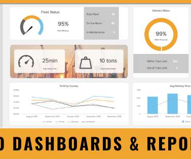
Enter data dashboards – one of history’s best innovations in business intelligence. To help you understand this notion in full, we’re going to explore a data dashboard definition, explain the power of dashboard data, and explore a selection of data dashboard examples. What Is A Data Dashboard?
Datavisualization is a fundamental step for successful data analysis. By giving your information a visual context, you make it more understandable and prepared to identify trends, patterns, or problems. In this post, we will introduce you to one of the most straightforward types of datavisualizations, the gauge chart.
journalists, authors, marketers — have come to appreciate the impact that data can bring to their message. However, arriving at a shared definition of what is (and what is not) a data story has been elusive. We’d like to offer the following definition to bring clarity and draw boundaries around the concept of data storytelling.
Powered by intuitive datavisualizations, these kinds of modern monthly progress reports assist managers and team members in managing their data in the most efficient and effective way possible while enhancing collaboration and healthy business growth. There are several business scenarios in which monthly reports are useful.
We will explain the ad hoc reporting meaning, benefits, uses in the real world, but first, let’s start with the ad hoc reporting definition. And this lies in the essence of the ad hoc reporting definition; providing quick reports for single-use, without generating complicated SQL queries. . Datavisualization capabilities.
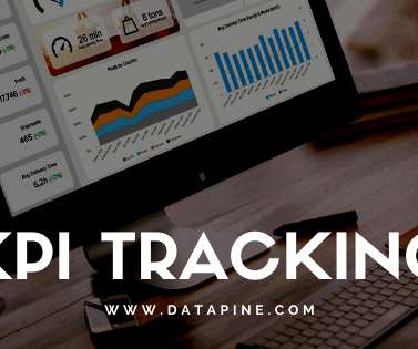
KPI tracking is a definitive means of monitoring your most relevant key performance indicators for increased business success with the help of modern KPI software. The post Your Definitive Guide To KPI Tracking By Utilizing Modern Software & Tools appeared first on BI Blog | DataVisualization & Analytics Blog | datapine.
Establishing Access and Security Guidelines – Your business will definitely need a Mobile Business Intelligence Solution in this day and age – that goes without saying. Achieve and build on results as your business moves forward.
Establishing Access and Security Guidelines – Your business will definitely need a Mobile Business Intelligence Solution in this day and age – that goes without saying. Achieve and build on results as your business moves forward.
Establishing Access and Security Guidelines – Your business will definitely need a Mobile Business Intelligence Solution in this day and age – that goes without saying. Achieve and build on results as your business moves forward.
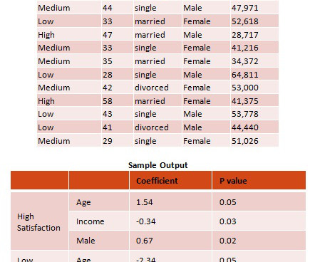
This article provides a brief definition of the multinomial-logistic regression classification algorithm and its uses and benefits. These tools are designed for business users with average skills and require no specialized knowledge of statistical analysis or support from IT or data scientists.
This article provides a brief definition of the multinomial-logistic regression classification algorithm and its uses and benefits. These tools are designed for business users with average skills and require no specialized knowledge of statistical analysis or support from IT or data scientists.
In this article, we will explain the basic definition of procurement reports, talk about the benefits and challenges that occur when dealing with procurement data to provide you with innovative ideas on spotting inefficiencies. And procurement reporting is no exception to this. There are a host of benefits to procurement reporting.
What are key metrics in this case enabling – is an environment that focuses on making the right decision at the right time since they will present the data, and help you derive insights. They help you monitor the financial health: To safeguard the financial performance of your company, monitoring financial metrics is essential.
Language requires definitions. Definitions and how they vary depending on context are central to semantics. Even in particular fields of study and practice, such as my field of datavisualization, practitioners often fail to define even its core terms in ways that are shared.
With its LookML modeling language, Looker provides a unique, modern approach to define governed and reusable data models to build a trusted foundation for analytics. Connecting directly to this semantic layer will help give customers access to critical business data in a safe, governed manner.
Armed with powerful visualizations and real-time data, modern weekly summary reports enable businesses to closely monitor their performance and the progress of their strategies to extract relevant insights and optimize their processes to ensure constant growth. Let’s kick it off with the definition.
To put the power of CRM software (or customer relationship management dashboard software) into a living, breathing, real-world perspective, we’ll explore CRM dashboards in more detail, starting with basic definitions of such dashboards and reports while considering how you can use CRM dashboard software to your business-boosting advantage.
Even though a timeline chart wouldn’t solve all of those problems, per se, it’ll definitely help. Unless you need to track dependencies, a timeline chart might be a simpler way to monitor your progress. A simple definition with examples appeared first on monday.com Blog. Image Source ). Get started.
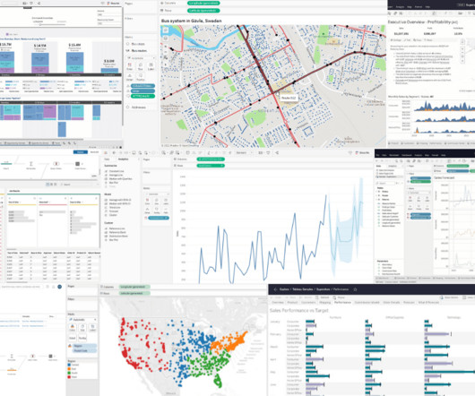
A digital dashboard is an electronic tracking tool used to build an interactive, visual representation of data from a host of sources including databases, CRM- and ERP data or other web services to monitor important business metrics and overall company’s performance. The 6 Key Benefits Of Using Digital Dashboards.
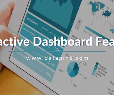
An interactive dashboard is a data management tool that tracks, analyzes, monitors, and visually displays key business metrics while allowing users to interact with data, enabling them to make well-informed, data-driven, and healthy business decisions. Say you want to visualize your revenue data by country.
Self-Serve Advanced Analytics provides a roadmap to guide you through a maze of organizational data with tools and models that will bring together data from disparate sources and enable sophisticated yet simple analytics. These tools allow the enterprise to establish and monitor key metrics and to objectively assess results.
Self-Serve Advanced Analytics provides a roadmap to guide you through a maze of organizational data with tools and models that will bring together data from disparate sources and enable sophisticated yet simple analytics. These tools allow the enterprise to establish and monitor key metrics and to objectively assess results.
Self-Serve Advanced Analytics provides a roadmap to guide you through a maze of organizational data with tools and models that will bring together data from disparate sources and enable sophisticated yet simple analytics. These tools allow the enterprise to establish and monitor key metrics and to objectively assess results.
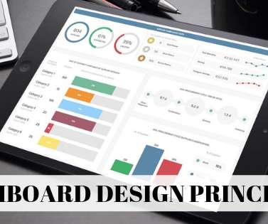
To help you on your journey to data-driven success, we’ll delve into 14 dashboard design principles that will ensure you develop the most comprehensive dashboard for your personal business needs. We can’t stress enough the importance of choosing the right datavisualization types. Without further ado – let’s get started.
But first, we will start with a basic definition and some tips on creating these kinds of reports. First things first – organizing and prioritizing your marketing data. Regularly monitor your data. There are numerous marketing report types, depending on which data you need to monitor and analyze.
With ‘big data’ transcending one of the biggest business intelligence buzzwords of recent years to a living, breathing driver of sustainable success in a competitive digital age, it might be time to jump on the statistical bandwagon, so to speak. “Data is what you need to do analytics. click for book source**.
Moreover, within just five years, the number of smart connected devices in the world will amount to more than 22 billion – all of which will produce colossal sets of collectible, curatable, and analyzable data, claimed IoT Analytics in their industry report. Consider your data sources. 5) Drill down into datavisualization.
Through the art of streamlined visual communication, data dashboards permit businesses to engage in real-time and informed decision-making and are key instruments in data interpretation. First of all, let’s find a definition to understand what lies behind data interpretation meaning.
With the rise of modern self-service BI tools , everyone can monitor relevant performance indicators in a matter of seconds. Having the ability to analyze your data fast and efficiently doesn’t always mean you are doing it correctly. Let’s quick it off with the definition of metrics and KPIs! But this is not without problems.
The financial health, flow, and fluidity of your business will ultimately dictate its long-term success, which is why monitoring your money matters carefully, comprehensively, and accurately is absolutely essential. Online datavisualization is taking precedence in business operations, creating more efficient and faster workspaces.
Reporting being part of an effective DQM, we will also go through some data quality metrics examples you can use to assess your efforts in the matter. But first, let’s define what data quality actually is. What is the definition of data quality? What Are Data Quality Metrics Examples?
DataVisualization Once the analysis is complete, the results are interpreted to generate findings relevant to the business. Datavisualization presents these findings in a clear and understandable format: Creating Visuals : Representing analysis results with charts, graphs, and dashboards.
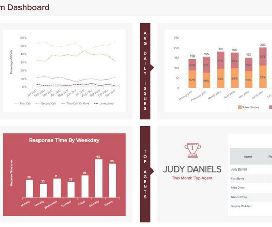
Monitoring the business performance and tracking relevant insights in today’s digital age has empowered managers and c-level executives to obtain an invaluable volume of data that increases productivity and decreases costs. Let’s start with a simple definition. Exclusive Bonus Content: Get Started With Scores And Business KPIs!
Moreover, companies are becoming more data-driven, complex, and require stable performance in order to succeed in our cutthroat digital age. Similarly to C-level financial officers that use a CFO dashboard to monitor financial information, COOs need a solution for operational touchpoints that make a business tick.
Kuber Sharma Director, Product Marketing, Tableau Kristin Adderson August 22, 2023 - 12:11am August 22, 2023 Whether you're a novice data analyst exploring the possibilities of Tableau or a leader with years of experience using VizQL to gain advanced insights—this is your list of key Tableau features you should know, from A to Z.
They enable powerful datavisualization. If you’re able to visualize your data with the help of online datavisualization , making it digestible to the human eye, you’ll be able to tell a story with your insights and communicate your discoveries to others more effectively.
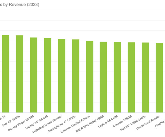
2) Pros & Cons Of Bar Charts 3) When To Use A Bar Graph 4) Types Of Bar Charts 5) Bar Graphs & Charts Best Practices 6) Bar Chart Examples In today’s fast-paced analytical landscape, datavisualization has become one of the most powerful tools organizations can benefit from to be successful with their analytical efforts.
2) Pros & Cons Of Column Charts 3) When To Use A Column Graph 4) Types Of Column Charts 5) Column Graphs & Charts Best Practices 6) Column Chart Examples Datavisualization has been a part of our lives for many many years now. Let’s get started with the definition! What Is A Column Chart or Graph?
BI architecture has emerged to meet those requirements, with data warehousing as the backbone of these processes. But first, let’s start with basic definitions. One of the BI architecture components is data warehousing. The output data of both terms also vary. Exclusive Bonus Content: Wondering about BI & DWH?
Exclusive Bonus Content: Your Definitive Guide to SaaS & Dashboards! Whether you need to develop an IT report or tackle deeper into the financial analytics side of the business, a dashboard will prove its worth when you see all your data in a clean, interactive screen. 1) Data management. Let’s get started. 3) Cohesion .
It seems clear that there isn’t one standard “correct” definition of the differences between the two terms. The most straightforward and useful difference between business intelligence and data analytics boils down to two factors: What direction in time are we facing; the past or the future? Definition: description vs prediction.
The first in our definitive rundown of tech buzzwords 2020 is computer vision. Exciting and futuristic, the concept of computer vision is based on computing devices or programs gaining the ability to extract detailed information from visual images. Exclusive Bonus Content: Download our Top 10 Technology Buzzwords! Computer Vision.
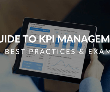
But first, let’s start with a simple definition. KPI management is the process of selecting, monitoring, and analyzing specific industry key performance indicators (or KPIs). Define a monitoring schedule Rounding out our list of KPI best practices, remember that KPIs that aren’t routinely monitored can’t influence your strategy.
We organize all of the trending information in your field so you don't have to. Join 57,000+ users and stay up to date on the latest articles your peers are reading.
You know about us, now we want to get to know you!
Let's personalize your content
Let's get even more personalized
We recognize your account from another site in our network, please click 'Send Email' below to continue with verifying your account and setting a password.


Let's personalize your content