This site uses cookies to improve your experience. To help us insure we adhere to various privacy regulations, please select your country/region of residence. If you do not select a country, we will assume you are from the United States. Select your Cookie Settings or view our Privacy Policy and Terms of Use.
Cookie Settings
Cookies and similar technologies are used on this website for proper function of the website, for tracking performance analytics and for marketing purposes. We and some of our third-party providers may use cookie data for various purposes. Please review the cookie settings below and choose your preference.
Used for the proper function of the website
Used for monitoring website traffic and interactions
Cookie Settings
Cookies and similar technologies are used on this website for proper function of the website, for tracking performance analytics and for marketing purposes. We and some of our third-party providers may use cookie data for various purposes. Please review the cookie settings below and choose your preference.
Strictly Necessary: Used for the proper function of the website
Performance/Analytics: Used for monitoring website traffic and interactions
We have talked in the past about the importance of datavisualization in business. However, many companies are struggling to figure out how to use datavisualization effectively. One of the ways to accomplish this is with presentation templates that can use datamodeling. Keep reading to learn more.
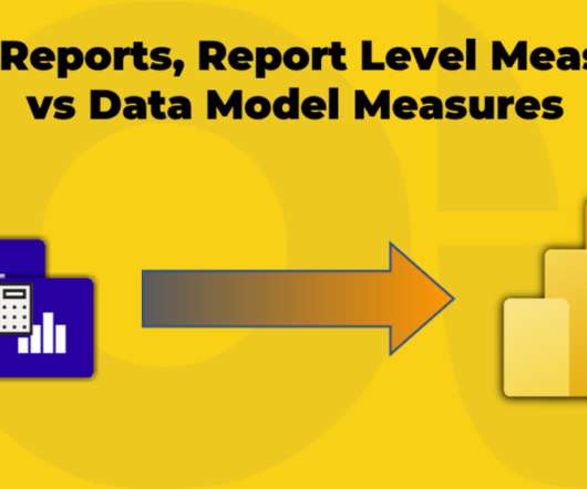
If you are not sure what Thin Report means, … Continue reading Thin Reports, Report Level Measures vs DataModel Measures. The post Thin Reports, Report Level Measures vs DataModel Measures appeared first on BI Insight. We discuss what report-level measures are, when and why we need them and how we create them.
According to Forbes, Almost eighty-thousand scientific studies attest that visual images promote retention. Graphs, charts with colors, lines and shapes can often tell a story and communicate issues, challenges and opportunities in a business environment. Lets […]
If you occasionally run business stands in fairs, congresses and exhibitions, business stands designers can incorporate business intelligence to aid in better business and client data collection. Business intelligence tools can include data warehousing, datavisualizations, dashboards, and reporting.
Employing an analytical system in a data-driven business can help it to discover useful trends, information, conclusions and elevated decision making. Power BI proves to be the best tool for analysis and visualization of data. Data Processing, Data Integration, and Data Presenting form the nucleus of Power BI.
This feature helps automate many parts of the data preparation and datamodel development process. This significantly reduces the amount of time needed to engage in data science tasks. A text analytics interface that helps derive actionable insights from unstructured data sets.
Therefore, machine learning is of great importance for almost any field, but above all, it will work well where there is Data Science. Data Mining Techniques and DataVisualization. Data Mining is an important research process.
Since the field covers such a vast array of services, data scientists can find a ton of great opportunities in their field. Data scientists use algorithms for creating datamodels. These datamodels predict outcomes of new data. Data science is one of the highest-paid jobs of the 21st century.
The importance of data analysis cannot be overstated, but if the enterprise does not choose the right data analysis tool, it will not achieve its potential and it is likely to frustrate the business users who are now expected to participate in the analytical process.
The importance of data analysis cannot be overstated, but if the enterprise does not choose the right data analysis tool, it will not achieve its potential and it is likely to frustrate the business users who are now expected to participate in the analytical process.
The importance of data analysis cannot be overstated, but if the enterprise does not choose the right data analysis tool, it will not achieve its potential and it is likely to frustrate the business users who are now expected to participate in the analytical process.
Introduction Power BI is the leading tool for data analytics that is in such an ever-evolving field; it has played out a whole level when talking about datavisualization and business intelligence. Most of the companies all over the different sectors make use of it for the transformation of raw data into meaningful insights.
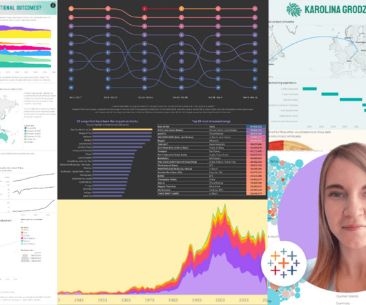
Countless hours vizzing, a standout Tableau Public profile , and a graduate degree later, Karolina reflects on her data journey and what led her to her current role as a Business Intelligence Analyst at Schneider Electric. I already had some interest in datavisualization, I just didn't know where to start.
The primary reason data lakes were so attractive to companies was the promise of agile processing of data in order to provide real-time (or near real-time) results on data sets. In order for this to even be possible, the datavisualization aspect needs to be streamlined to show exactly what the user wants to see.
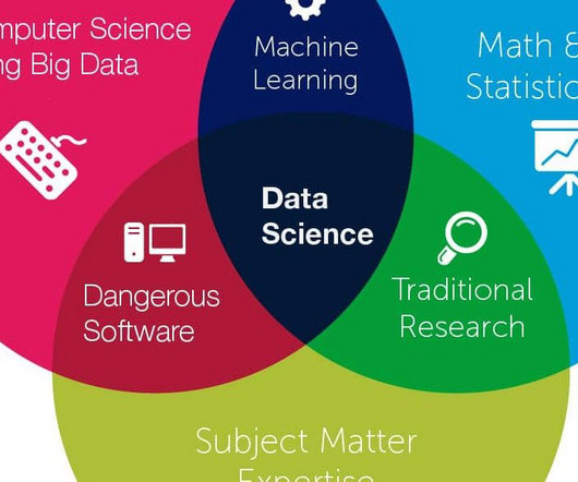
Data scientists use a variety of techniques and tools to collect, analyze, and interpret data, and communicate their findings to stakeholders. Data science involves several steps, including data collection, data cleaning, data exploration, datamodeling, and datavisualization.
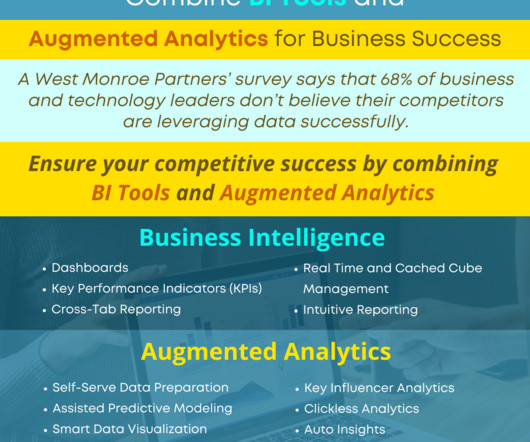
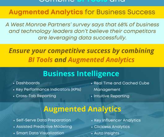
Recent studies have focused on the trends in business intelligence and augmented analytics, predicting that businesses will grow analytics within the enterprise with: Augmented Analytics to enable non-technical business users to create sophisticated datamodels.
Recent studies have focused on the trends in business intelligence and augmented analytics, predicting that businesses will grow analytics within the enterprise with: Augmented Analytics to enable non-technical business users to create sophisticated datamodels.
Recent studies have focused on the trends in business intelligence and augmented analytics, predicting that businesses will grow analytics within the enterprise with: Augmented Analytics to enable non-technical business users to create sophisticated datamodels. Smart DataVisualization. Auto Insights.
Here’s a brief comparison: Tableau: For datavisualization specialists, Tableau is more preferred. It features rich visualizations with highly interactive dashboards. Advanced Reporting: Path layer for Azure Map Visual. Visual calculations within reports. Small multiples for new card visual.
The purpose of datavisualization is to facilitate the perception of information arrays and to identify patterns that are difficult to notice in a text table. To make a useful and powerful infographic, you need to follow the laws and regulations of datavisualization.
Power BI Data Engineer: Manages data pipelines, integrates data sources, and makes data available for analysis. Creates datamodels, streamlines ETL processes, and enhances Power BI performance. ollaborates with analysts and IT teams to provide smooth data flow. Developing automated data pipelines.
These solutions are sophisticated, yet easy enough for the average user to adopt, and they allow users to generate models and analysis and to use metrics and facts to make decisions, make recommendations and share data with other users. But, the Citizen Data Scientist doesn’t have to do it alone.
These solutions are sophisticated, yet easy enough for the average user to adopt, and they allow users to generate models and analysis and to use metrics and facts to make decisions, make recommendations and share data with other users. But, the Citizen Data Scientist doesn’t have to do it alone.
These solutions are sophisticated, yet easy enough for the average user to adopt, and they allow users to generate models and analysis and to use metrics and facts to make decisions, make recommendations and share data with other users. But, the Citizen Data Scientist doesn’t have to do it alone.
Garnering over more than 6 decades of gaming intelligence experience of our founding team and using advanced technologies like AI & machine learning have a custom-built gaming accelerator platform that provides both visualization and data analytics. Data Enrichment/Data Warehouse Layer. Data Analytics Layer.
What if your business users could leverage self-serve advanced analytics to see and use data in a way that made their jobs easier and made them more of an asset to the business? Assisted predictive modeling suggests techniques to analyze data that will result in the right outcome for the goals of the analysis.
What if your business users could leverage self-serve advanced analytics to see and use data in a way that made their jobs easier and made them more of an asset to the business? Assisted predictive modeling suggests techniques to analyze data that will result in the right outcome for the goals of the analysis.
What if your business users could leverage self-serve advanced analytics to see and use data in a way that made their jobs easier and made them more of an asset to the business? Assisted predictive modeling suggests techniques to analyze data that will result in the right outcome for the goals of the analysis.
Building an effective dashboard according to best practices for dashboard design is the culmination of a comprehensive BI process that would usually include gathering requirements, defining KPIs, and creating a datamodel. This is where the visual layout of a dashboard plays a crucial role. Minimalism: Less Is More.
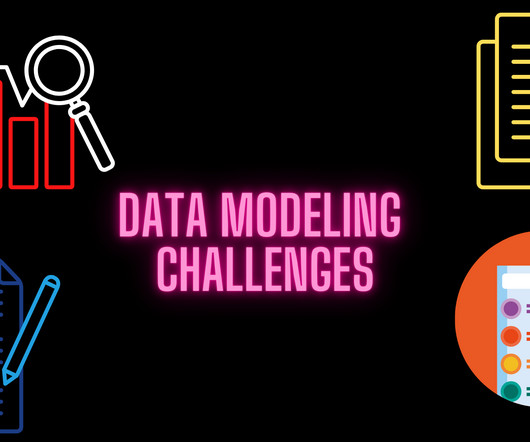
DataModeling challenges Despite all the benefits data mapping brings to businesses, its not without its own set of challenges. Mapping data fields Mapping data fields directly is essential for getting the asked results from your data migration design.
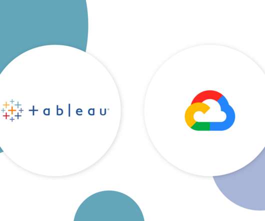
Tableau and Google Cloud are partnering to help modernize your data and analytics infrastructure and unlock your data’s full value. Google's Cloud Platform is the enterprise solution of choice for many organizations with large and complex data problems. With Tableau, any user can visually explore that data in real time.
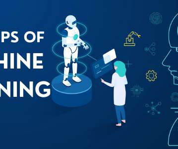
It primarily focuses on developing models that use algorithms to learn and detect patterns, trends, and associations from existing data. Models can apply this learning to new data. Let us have a look at the steps of machine learning followed while building a machine learning model. DataVisualization.
Organizations that can effectively leverage data as a strategic asset will inevitably build a competitive advantage and outperform their peers over the long term. In order to achieve that, though, business managers must bring order to the chaotic landscape of multiple data sources and datamodels.
The provider’s analytics platform plugs into your data source, crunches your numbers, and then generates reports and dashboard datavisualizations. The right platform will give you total control over the widgets in your datavisualizations, ideally in a user-friendly UI editor (like in Sisense’s Embedded Playground ).
What Microsoft Power BI does is that it will collect all the software services, apps and web that you desire and connect every piece of data with each other. The end product is a visual projection of insights that you might know and the ones you should know. Datamodelling and visualizations. Working of Power BI.
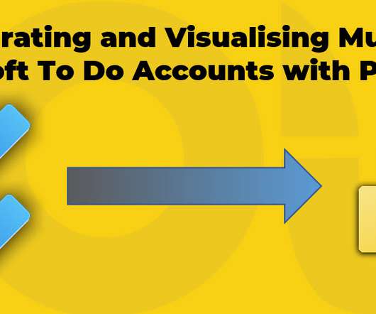
It’s been a while that I use Microsoft To Do to organise my daily tasks. From work-related tasks to buy groceries. While Microsoft To Do is super easy to use but there are some challenges in using it more efficiently, especially when you have multiple O365 accounts within different organisations.
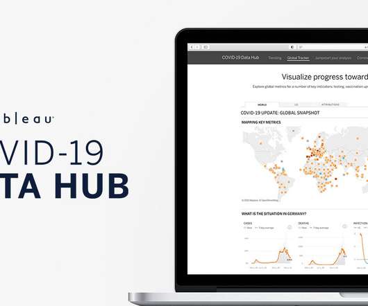
Today, on the Tableau COVID-19 Data Hub , we launch a new Global Tracker that combines and visualizes the key metrics that measure our return to normalcy. We can begin to visualize light at the end of this long and unyielding tunnel—and where we are in this journey is a question we can explore with data insights. .
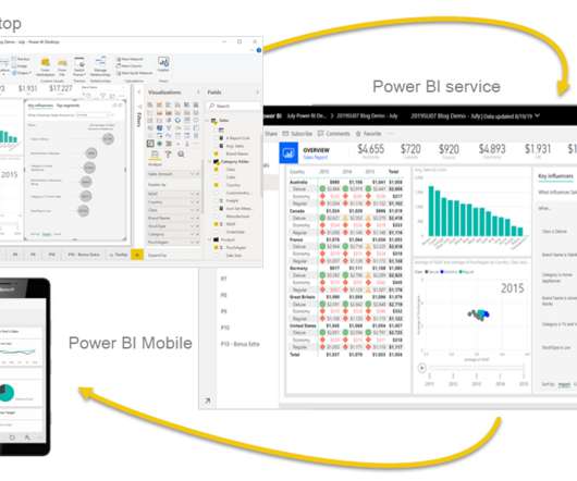
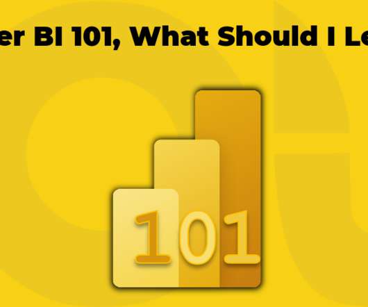
This is the second part of my new series of Power BI posts named Power BI 101. In the previous post, I briefly discussed what Power BI is. In this post, I look into one of the most confusing parts for those who want to start learning Power BI. Many people jump straight online and … Continue reading Power BI 101, What Should I Learn?
Power BI is a datavisualization and data analytics platform moreover it can be a services BI tool developed by Microsoft under the power platform. The integration of these technologies turns different sources of data into deep insights and static and interactive visualization. It has more than 300 data connectors.
Now powered by Tableau, Genie brings that trusted, up-to-the-moment customer data to life by layering on visual, explorable, and actionable analytics and insights. . We're also providing secure, real-time, and open data sharing between Salesforce and Snowflake. Cut costs by consolidating data warehouse investments.
Now powered by Tableau, Genie brings that trusted, up-to-the-moment customer data to life by layering on visual, explorable, and actionable analytics and insights. . We're also providing secure, real-time, and open data sharing between Salesforce and Snowflake. Cut costs by consolidating data warehouse investments.
This means that every exercise is a complex challenge of data engineering, and even when the work is done the results are removed from your visualization and reporting solutions. What’s been missing is a way to natively integrate Python and R with the rest of the data analytics stack. No more data engineering!
In the case of a stock trading AI, for example, product managers are now aware that the data required for the AI algorithm must include human emotion training data for sentiment analysis. It follows then that data scientists are suddenly integral to building embedded AI components.
To simplify things, you can think of back-end BI skills as more technical in nature and related to building BI platforms, like online datavisualization tools. Front-end analytical and business intelligence skills are geared more towards presenting and communicating data to others. b) If You’re Already In The Workforce.
We organize all of the trending information in your field so you don't have to. Join 57,000+ users and stay up to date on the latest articles your peers are reading.
You know about us, now we want to get to know you!
Let's personalize your content
Let's get even more personalized
We recognize your account from another site in our network, please click 'Send Email' below to continue with verifying your account and setting a password.


Let's personalize your content