This site uses cookies to improve your experience. To help us insure we adhere to various privacy regulations, please select your country/region of residence. If you do not select a country, we will assume you are from the United States. Select your Cookie Settings or view our Privacy Policy and Terms of Use.
Cookie Settings
Cookies and similar technologies are used on this website for proper function of the website, for tracking performance analytics and for marketing purposes. We and some of our third-party providers may use cookie data for various purposes. Please review the cookie settings below and choose your preference.
Used for the proper function of the website
Used for monitoring website traffic and interactions
Cookie Settings
Cookies and similar technologies are used on this website for proper function of the website, for tracking performance analytics and for marketing purposes. We and some of our third-party providers may use cookie data for various purposes. Please review the cookie settings below and choose your preference.
Strictly Necessary: Used for the proper function of the website
Performance/Analytics: Used for monitoring website traffic and interactions
In fact, 90% of the worlds data has been created in just the past two years, underscoring the rapid pace of data generation. However, the explosion of data has […] The post Mastering DataVisualizations for Better Understanding appeared first on DATAVERSITY.
Datavisualization has become a major part of life for those looking to make use of the large swathes of data available in the modern world. As important as this data is, understanding and making use of that data is even more important. That’s where datavisualization comes in. Images add to your SEO.
It can be used for something as visual as reducing traffic jams, to personalizing products and services, to improving the experience in multiplayer video games. There is no disputing the fact that the collection and analysis of massive amounts of unstructured data has been a huge breakthrough. What is data virtualization?
Can Smart DataVisualization Make My Business Smarter? All the data in the world can’t help you improve your business results unless you can sift through it and see it in a way that tells a story – a story that leads you to a conclusion, helps you solve a problem or allows you to see how your business can grow, change and succeed.
Can Smart DataVisualization Make My Business Smarter? All the data in the world can’t help you improve your business results unless you can sift through it and see it in a way that tells a story – a story that leads you to a conclusion, helps you solve a problem or allows you to see how your business can grow, change and succeed.
How will datavisualization evolve in the era of AI/ML? The challenge is to move beyond these unintelligent dashboards to a genuinely transformative visual analytics solution that harnesses the power of AI/ML. While AI is rapidly evolving, it is ironic that business users are still using “dumb” dashboards.
Machine Learning and Smart DataVisualization – The Perfect Combination! Data Analysis is one thing but visualizing the data in a meaningful way is a whole different story! So, let me tell you about smart datavisualization. Do you want to experience the benefits of Smart DataVisualization?
Machine Learning and Smart DataVisualization – The Perfect Combination! Data Analysis is one thing but visualizing the data in a meaningful way is a whole different story! So, let me tell you about smart datavisualization. Do you want to experience the benefits of Smart DataVisualization?
However, presenting data is a crucial exercise that requires a lot of creativity to ensure that every team member can grasp the meaning of the content. Many people get confused about how to find valuable insights from a large volume of data in a spreadsheet. That’s […].
I started my career as a data analyst in a controlling department immediately following my graduation from the University of West Bohemia; I now work as a data scientist providing consultancy services for a range of different fields. The data analysis itself is the fun part. […].
Effective DataVisualization Techniques In todays data-driven world, the ability to present data clearly and effectively is essential. Datavisualization transforms complex data into visual formats like charts, graphs, and dashboards, making it easier to analyze, interpret, and communicate insights.
Datavisualizations can reveal important insights, yet many struggle to create effective representations of information. This blog post, "Mastering DataVisualization Techniques to Unlock Your Potential," will explore the fundamentals of datavisualization, essential tools, and advanced techniques.
Now that you’re sold on the power of data analytics in addition to data-driven BI, it’s time to take your journey a step further by exploring how to effectively communicate vital metrics and insights in a concise, inspiring, and accessible format through the power of visualization. Datavisualization: What You Need To Know.
Let’s say you are a data scientist at a top Fortune company, dealing with budget portfolio optimizations worth millions of dollars annually for various clients. It is essential to effectively communicate your […] The post A Picture Is Worth 1,000 Words: The Importance of DataVisualization appeared first on DATAVERSITY.
It pertains to trends in many fields, including but not limited to AI, ML, IoT, game development, datavisualization, and NLP on cloud computing. This blog includes the latest Python trends, showing how th. Read More.
According to Forbes, Almost eighty-thousand scientific studies attest that visual images promote retention. Graphs, charts with colors, lines and shapes can often tell a story and communicate issues, challenges and opportunities in a business environment. Lets […]
Table of Contents 1) The Benefits Of DataVisualization 2) Our Top 27 Best DataVisualizations 3) Interactive DataVisualization: What’s In It For Me? 4) Static vs. Animated DataVisualizationData is the new oil? No, data is the new soil.”
However, with the ever-increasing volume and complexity of data, it’s essential to have an effective data navigation system to optimize your BI strategy. Layered navigation is a powerful tool that can improve your BI strategy by providing better access to relevant data and insights.
“By visualizing information, we turn it into a landscape that you can explore with your eyes. 90% of the information transmitted to the brain is visual. Concerning professional growth, development, and evolution, using data-driven insights to formulate actionable strategies and implement valuable initiatives is essential.
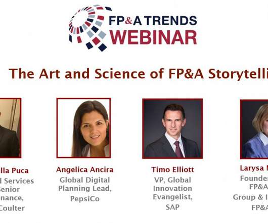
With advanced analytics, flexible dashboarding and effective datavisualization, FP&A storytelling has become both an art and science. You can find a blog post version of my commentary below, and a draft video of my section: What’s new with analytics and storytelling for finance teams? What typically goes wrong?
DataVisualization and Dashboard Creation Complex datasets require intuitive visualization tools to make insights accessible. BI consultants often design dashboards and reports that simplify data interpretation, empowering leaders to identify patterns and trends quickly.
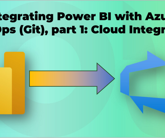
Power BI is a powerful tool for creating and sharing interactive datavisualizations. But how can you collaborate with other developers on your Power BI projects and ensure quality and consistency across your reports?
Promoting transparency is possible through seven statistical procedures: Datavisualization Quantifying inferential uncertainty Assessment of data preprocessing choices Reporting multiple models Involving […].
Source: Mirko Peters with MidJourney and Canva Have you ever walked into a meeting brimming with excitement about a new data project, only to be met with blank stares and crossed arms? I remember my first presentation on a data governance initiative; I was full of hope, but the room felt as cold as an icebox. And who knows?
If you work in data and analytics, particularly within the Microsoft Data Platform, you have likely heard of Microsoft Fabric and its many capabilities. However, one of the biggest challenges organisations face is managing costs effectively.
” Well, think of BI tools as your personal data assistant. They pull together information from multiple sources, clean it up, analyze it, and then visualize it in ways that make it easy to interpret. It’s not just about gathering data—it’s about making it usable. DataVisualization: Data on its own can be overwhelming.
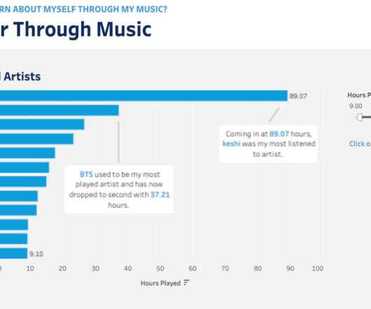
You don’t have to wait for your music streaming service to provide that for you anymore—you can see and learn from your listening data at any point in the year using Tableau. Whether this is your first Tableau visualization or your 100th, let this be a chance to practice and grow your viz-building skills using your own personal data!
From Edward Tufte's Visual Explanations, a diagram based on Salman Rushdie‘s description of the Indian epid Kathasaritsagara or Ocean of the Streams of Story. The hot new concept in datavisualization is "data storytelling"; some are calling it the next evolution of visualization (I'm one of them).
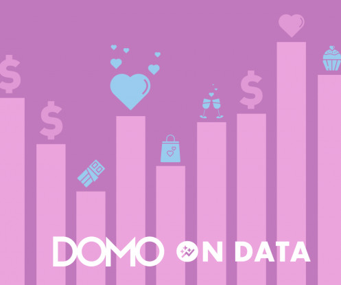
To create our Valentine’s visuals, we used Variables in Domo—a simple but powerful feature we launched in 2023. Variables give you an intuitive way to explore your data without having to build individual datavisualizations to account for every view of the data. Want to keep exploring Variables?
The real competitive edge lies in AI-powered analytics, which go beyond datavisualization to predict future outcomes and drive proactive decision-making. AI, Automation, and Predictive Intelligence The integration of Dynamics 365 with BI dashboards is just the beginning.
Gather and document business requirements Communicate between stakeholders and data teams Define key performance indicators (KPIs) and success metrics Interpret and translate data insights into business recommendations Assist in datavisualization and storytelling Ensure that data science models align with business objectives 2.
You don’t have to wait for your music streaming service to provide that for you anymore—you can see and learn from your listening data at any point in the year using Tableau. Whether this is your first Tableau visualization or your 100th, let this be a chance to practice and grow your viz-building skills using your own personal data!
In just a few days, we’ll all be watching—and I’ll be co-hosting for the fourth time— Iron Viz , the ultimate visualization showdown, at #Data21. In just 20 minutes, the three finalists, Lisa Trescott, Pradeep Kumar G, and Samuel Parsons, will build their best datavisualizations under the watchful eyes of our judges.
The Phocas business intelligence blog was created to provide free advice about data and add value to the way business people approach data problems or tasks. Now the scope of the blog has extended to include financial analysis, budgeting and forecasting and planning tips.
Learn datavisualization techniques Datavisualization is a critical skill for anyone working with data. It’s not enough to simply analyze data and draw conclusions; you also need to be able to communicate your findings effectively. This includes languages such as Python, R, and SQL.
A BI dashboard — or business intelligence dashboard — is an information management tool that uses datavisualization to display KPIs (key performance indicators) tracked by a business to assess various aspects of performance. They aim at simplifying huge amounts of data, into simpler insights that can been easily understood and used.
Sarah Molina Corporate Marketing Analyst Sarah Molina February 1, 2023 - 9:50pm February 4, 2023 Tableau Public is a free online visual analytics platform that allows you to learn and practice data skills, create and explore datavisualizations, discover data stories, and create your own portfolio of work to share with your network.
It takes a special combination of skills to articulate your insights and support them with effectively visualizeddata. You need to be part salesperson, part data analyst, and part author. We’ve collected 11 of the most useful tips and resources to help you improve how you present data.
Machine Learning Algorithms allows the system to understand data and applies correlation, classification, regression, or forecasting, or whichever technique is relevant, based upon the data the user wishes to analyze. Read our Blog to find out more about Clickless Analytics and Natural Language Processing.
Machine Learning Algorithms allows the system to understand data and applies correlation, classification, regression, or forecasting, or whichever technique is relevant, based upon the data the user wishes to analyze. Read our Blog to find out more about Clickless Analytics and Natural Language Processing.
A BI dashboard — or business intelligence dashboard — is an information management tool that uses datavisualization to display KPIs (key performance indicators) tracked by a business to assess various aspects of performance. They aim at simplifying huge amounts of data, into simpler insights that can been easily understood and used.
Why…a data story, of course! This is what happens when you write a blog post after learning your favorite sandwich shop is closing down…we’ll miss you Clawson’s ?? ). For data stories, that filling is the datavisualizations. Sure, the datavisualization is the star of the show. And a sandwich.
Check out our Data Personality Profile for a framework for evaluating your audience. Data Storytelling is Writing I hate to take you back to your writing classes but data storytelling isn’t just a collection of datavisualizations, it is a form of writing. Is the data story a collaboration or a one-way broadcast?
We organize all of the trending information in your field so you don't have to. Join 57,000+ users and stay up to date on the latest articles your peers are reading.
You know about us, now we want to get to know you!
Let's personalize your content
Let's get even more personalized
We recognize your account from another site in our network, please click 'Send Email' below to continue with verifying your account and setting a password.


Let's personalize your content