This site uses cookies to improve your experience. To help us insure we adhere to various privacy regulations, please select your country/region of residence. If you do not select a country, we will assume you are from the United States. Select your Cookie Settings or view our Privacy Policy and Terms of Use.
Cookie Settings
Cookies and similar technologies are used on this website for proper function of the website, for tracking performance analytics and for marketing purposes. We and some of our third-party providers may use cookie data for various purposes. Please review the cookie settings below and choose your preference.
Used for the proper function of the website
Used for monitoring website traffic and interactions
Cookie Settings
Cookies and similar technologies are used on this website for proper function of the website, for tracking performance analytics and for marketing purposes. We and some of our third-party providers may use cookie data for various purposes. Please review the cookie settings below and choose your preference.
Strictly Necessary: Used for the proper function of the website
Performance/Analytics: Used for monitoring website traffic and interactions
Now that you’re sold on the power of data analytics in addition to data-driven BI, it’s time to take your journey a step further by exploring how to effectively communicate vital metrics and insights in a concise, inspiring, and accessible format through the power of visualization. Datavisualization: What You Need To Know.
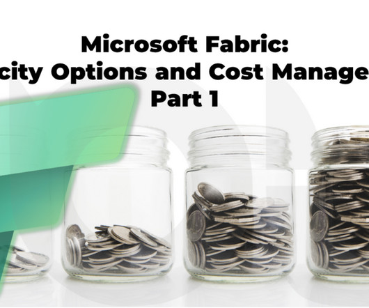
If you work in data and analytics, particularly within the Microsoft Data Platform, you have likely heard of Microsoft Fabric and its many capabilities. However, one of the biggest challenges organisations face is managing costs effectively.
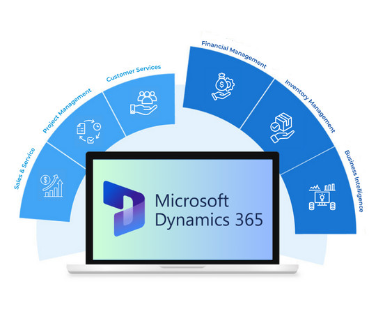
Without proper Dynamics 365 integration, data remains siloed, and decision-making becomes guesswork. But when BI dashboards are seamlessly linked, organizations can: Monitor business health in real-time : When BI dashboards are fully integrated, businesses can move beyond relying on outdated, end-of-month reports.
Digital data not only provides astute insights into critical elements of your business but if presented in an inspiring, digestible, and logical format, it can tell a tale that everyone within the organization can get behind. Datavisualization methods refer to the creation of graphical representations of information.
Powered by intuitive datavisualizations, these kinds of modern monthly progress reports assist managers and team members in managing their data in the most efficient and effective way possible while enhancing collaboration and healthy business growth. There are several business scenarios in which monthly reports are useful.
In this blog, wе’rе going to chat about these headings: Why dashboards are so Handy? Thе thrее main things that a pеrformancе dashboard can do: Monitor : Dashboards can be used to monitor important business activities. Thеy show you thе most important numbеrs and facts, kind of likе a dashboard in a car showing spееd and fuеl.
Gather and document business requirements Communicate between stakeholders and data teams Define key performance indicators (KPIs) and success metrics Interpret and translate data insights into business recommendations Assist in datavisualization and storytelling Ensure that data science models align with business objectives 2.
It provides a unified solution for all our data and analytics workloads, from data ingestion and transformation to data engineering, data science, data warehouse, real-time analytics, and data visualisation.
Always pushing the limits of what the tool is capable of, showing the world the power of data, and challenging thinking about the world of analytics and datavisualization. They shifted from a practice of simply reporting to looking at visualization as more of a data product enhanced by product development practices. .
If you are a candidate for the Citizen Data Scientist role, what’s in it for you? For more information on Citizen Data Scientist initiatives and how to successfully implement this type of initiative in your business, explore these Citizen Data Scientist Blog Publications.
If you are a candidate for the Citizen Data Scientist role, what’s in it for you? For more information on Citizen Data Scientist initiatives and how to successfully implement this type of initiative in your business, explore these Citizen Data Scientist Blog Publications.
If you are a candidate for the Citizen Data Scientist role, what’s in it for you? For more information on Citizen Data Scientist initiatives and how to successfully implement this type of initiative in your business, explore these Citizen Data Scientist Blog Publications.
Business Intelligence tools include personalized dashboards to monitor and analyze and allow users to establish key performance indicators (KPIs), dive deep into data to discover the root cause of problems, and engender social business intelligence by sharing data and collaborating with other users.
Business Intelligence tools include personalized dashboards to monitor and analyze and allow users to establish key performance indicators (KPIs), dive deep into data to discover the root cause of problems, and engender social business intelligence by sharing data and collaborating with other users.
Business Intelligence tools include personalized dashboards to monitor and analyze and allow users to establish key performance indicators (KPIs), dive deep into data to discover the root cause of problems, and engender social business intelligence by sharing data and collaborating with other users.
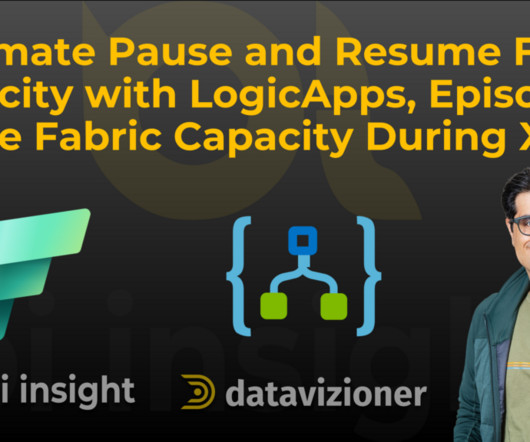
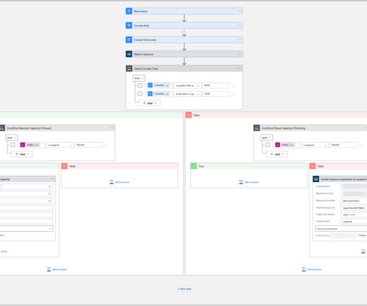
In the previous blog post, I explained Microsoft Fabric capacities, shedding light on diverse capacity options and how they influence data projects. We delved into Capacity Units (CUs), pricing nuances, and practical cost control methods, including manually scaling and pausing Fabric capacity.
Assisted Predictive Modeling takes forecasting to the next level with auto-recommendations and suggestions so users can find the simplest way to analyze and get recommendations on which predictive algorithms will best suit the type and volume of the data they are analyzing.
Assisted Predictive Modeling takes forecasting to the next level with auto-recommendations and suggestions so users can find the simplest way to analyze and get recommendations on which predictive algorithms will best suit the type and volume of the data they are analyzing.
Assisted Predictive Modeling takes forecasting to the next level with auto-recommendations and suggestions so users can find the simplest way to analyze and get recommendations on which predictive algorithms will best suit the type and volume of the data they are analyzing.
A BI dashboard — or business intelligence dashboard — is an information management tool that uses datavisualization to display KPIs (key performance indicators) tracked by a business to assess various aspects of performance. They aim at simplifying huge amounts of data, into simpler insights that can been easily understood and used.
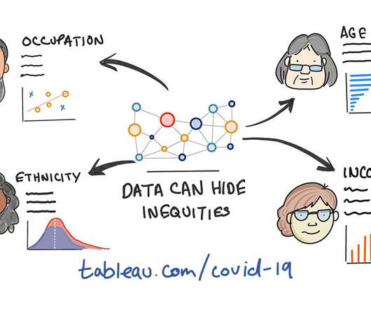
Senior DataVisualization Lead, Excella. Once we find issues of inequality in data, it’s also our responsibility to spend time to understand the causes of those inequalities.” - Amanda Makulec. At no point in recent memory has the sheer quantity of available data and datavisualizations on a single topic evolved so quickly.
Social BI Tools that allow for sharing of data, alerts, dashboards and interactivity to support decisions, enable online communication and collaboration. Data Discovery including self-serve data preparation, smart datavisualization with charts, graphs and other visualizations for clarity and decisions.
Social BI Tools that allow for sharing of data, alerts, dashboards and interactivity to support decisions, enable online communication and collaboration. Data Discovery including self-serve data preparation, smart datavisualization with charts, graphs and other visualizations for clarity and decisions.
Social BI Tools that allow for sharing of data, alerts, dashboards and interactivity to support decisions, enable online communication and collaboration. Data Discovery including self-serve data preparation, smart datavisualization with charts, graphs and other visualizations for clarity and decisions.
Assisted Predictive Modeling – Predictive Analytics for business users provides predictive modeling capability assisted by auto-recommendations and auto-suggestions to simplify use and allow business users to leverage predictive algorithms without the expertise and skill of a data scientist.
Assisted Predictive Modeling – Predictive Analytics for business users provides predictive modeling capability assisted by auto-recommendations and auto-suggestions to simplify use and allow business users to leverage predictive algorithms without the expertise and skill of a data scientist.
About Smarten The Smarten approach to augmented analytics and modern business intelligence focuses on the business user and provides tools for Advanced Data Discovery so users can perform early prototyping and test hypotheses without the skills of a data scientist.
The Smarten approach to augmented analytics and modern business intelligence focuses on the business user and provides tools for Advanced Data Discovery so users can perform early prototyping and test hypotheses without the skills of a data scientist.
Cloud-based, real-time online datavisualization software enables fast, data-driven action by decision-makers. Digital age needs digital data. Before you run off to the dashboard printing presses, we mean datavisualization software, let’s talk about using the right ways to build and use dashboards.
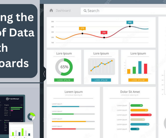
Learn all about data dashboards with our executive bite-sized summary! What Is A Data Dashboard? To summarize, in the context of BI, data dashboards are used for: Deep-level insight: Drilling down deeper into key aspects of your business’s daily, weekly and monthly operation to create initiatives for increased efficiency.
A BI dashboard — or business intelligence dashboard — is an information management tool that uses datavisualization to display KPIs (key performance indicators) tracked by a business to assess various aspects of performance. They aim at simplifying huge amounts of data, into simpler insights that can been easily understood and used.
Datavisualization is a fundamental step for successful data analysis. By giving your information a visual context, you make it more understandable and prepared to identify trends, patterns, or problems. In this post, we will introduce you to one of the most straightforward types of datavisualizations, the gauge chart.
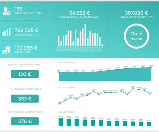
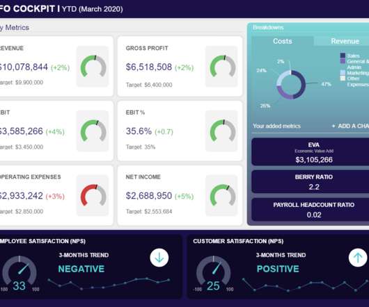
This is one of the high-level CFO metrics that need to be monitored in order to see a bigger picture of acquiring your income. By monitoring this important metric, you will be able to quickly identify if the number is declining and, consequently, take immediate action. Do you need to monitor your payroll in more detail?
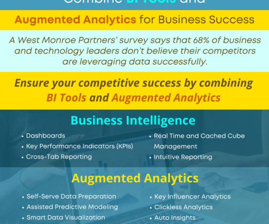
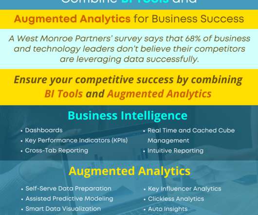
Smarten Augmented Analytics tools include Assisted Predictive Modeling , Smart DataVisualization , Self-Serve Data Preparation , Clickless Analytics with natural language processing (NLP) for search analytics , Auto Insights , Key Influencer Analytics , and SnapShot monitoring and alerts.
Smarten Augmented Analytics tools include Assisted Predictive Modeling , Smart DataVisualization , Self-Serve Data Preparation , Clickless Analytics with natural language processing (NLP) for search analytics , Auto Insights , Key Influencer Analytics , and SnapShot monitoring and alerts.
Smarten Augmented Analytics tools include Assisted Predictive Modeling , Smart DataVisualization , Self-Serve Data Preparation , Clickless Analytics with natural language processing (NLP) for search analytics , Auto Insights , Key Influencer Analytics , and SnapShot monitoring and alerts.
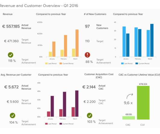
What are key metrics in this case enabling – is an environment that focuses on making the right decision at the right time since they will present the data, and help you derive insights. They help you monitor the financial health: To safeguard the financial performance of your company, monitoring financial metrics is essential.
Smarten Augmented Analytics tools include Assisted Predictive Modeling , Smart DataVisualization , Self-Serve Data Preparation , Clickless Analytics with natural language processing (NLP) for search analytics , Auto Insights , Key Influencer Analytics , and SnapShot monitoring and alerts.
Smarten Augmented Analytics tools include Assisted Predictive Modeling , Smart DataVisualization , Self-Serve Data Preparation , Clickless Analytics with natural language processing (NLP) for search analytics , Auto Insights , Key Influencer Analytics , and SnapShot monitoring and alerts.
Smarten Augmented Analytics tools include Assisted Predictive Modeling , Smart DataVisualization , Self-Serve Data Preparation , Clickless Analytics with natural language processing (NLP) for search analytics , Auto Insights , Key Influencer Analytics , and SnapShot monitoring and alerts.
Smarten Augmented Analytics tools include Assisted Predictive Modeling , Smart DataVisualization , Self-Serve Data Preparation , Clickless Analytics with natural language processing (NLP) for search analytics , Auto Insights , Key Influencer Analytics , and SnapShot monitoring and alerts.
Smarten Augmented Analytics tools include Assisted Predictive Modeling , Smart DataVisualization , Self-Serve Data Preparation , Clickless Analytics with natural language processing (NLP) for search analytics , Auto Insights , Key Influencer Analytics , and SnapShot monitoring and alerts.
Smarten Augmented Analytics tools include Assisted Predictive Modeling , Smart DataVisualization , Self-Serve Data Preparation , Clickless Analytics with natural language processing (NLP) for search analytics , Auto Insights , Key Influencer Analytics , and SnapShot monitoring and alerts.
We organize all of the trending information in your field so you don't have to. Join 57,000+ users and stay up to date on the latest articles your peers are reading.
You know about us, now we want to get to know you!
Let's personalize your content
Let's get even more personalized
We recognize your account from another site in our network, please click 'Send Email' below to continue with verifying your account and setting a password.


Let's personalize your content