This site uses cookies to improve your experience. To help us insure we adhere to various privacy regulations, please select your country/region of residence. If you do not select a country, we will assume you are from the United States. Select your Cookie Settings or view our Privacy Policy and Terms of Use.
Cookie Settings
Cookies and similar technologies are used on this website for proper function of the website, for tracking performance analytics and for marketing purposes. We and some of our third-party providers may use cookie data for various purposes. Please review the cookie settings below and choose your preference.
Used for the proper function of the website
Used for monitoring website traffic and interactions
Cookie Settings
Cookies and similar technologies are used on this website for proper function of the website, for tracking performance analytics and for marketing purposes. We and some of our third-party providers may use cookie data for various purposes. Please review the cookie settings below and choose your preference.
Strictly Necessary: Used for the proper function of the website
Performance/Analytics: Used for monitoring website traffic and interactions
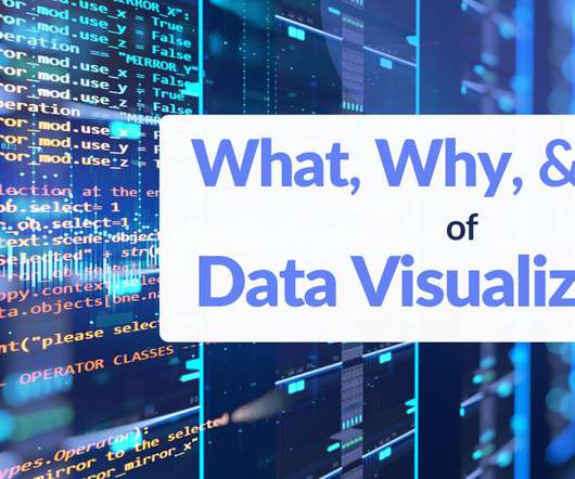
In fact, 90% of the worlds data has been created in just the past two years, underscoring the rapid pace of data generation. However, the explosion of data has […] The post Mastering DataVisualizations for Better Understanding appeared first on DATAVERSITY.
If the work of a human’s mind can be somehow represented, interactive datavisualization is the closest form of such representation right before pure art. So, what is Interactive datavisualization and how are they driven by modern interactive datavisualization tools? Check out this article.
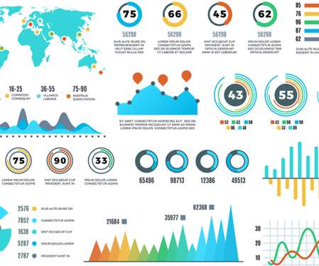
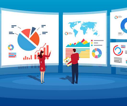
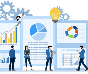
Datavisualization has become a major part of life for those looking to make use of the large swathes of data available in the modern world. As important as this data is, understanding and making use of that data is even more important. That’s where datavisualization comes in. Images add to your SEO.
However, computerization in the digital age creates massive volumes of data, which has resulted in the formation of several industries, all of which rely on data and its ever-increasing relevance. Data analytics and visualization help with many such use cases. It is the time of big data. Understand Your Audience.
How will datavisualization evolve in the era of AI/ML? The challenge is to move beyond these unintelligent dashboards to a genuinely transformative visual analytics solution that harnesses the power of AI/ML. While AI is rapidly evolving, it is ironic that business users are still using “dumb” dashboards.
Visualization has become an integral aspect of data analysis in today's data-driven environment. Businesses may obtain insights and make data-driven choices by using a variety of successful datavisualization approaches. This article will examine the many types of datavisualization.
However, presenting data is a crucial exercise that requires a lot of creativity to ensure that every team member can grasp the meaning of the content. Many people get confused about how to find valuable insights from a large volume of data in a spreadsheet. That’s […].
I started my career as a data analyst in a controlling department immediately following my graduation from the University of West Bohemia; I now work as a data scientist providing consultancy services for a range of different fields. The data analysis itself is the fun part. […].
Effective DataVisualization Techniques In todays data-driven world, the ability to present data clearly and effectively is essential. Datavisualization transforms complex data into visual formats like charts, graphs, and dashboards, making it easier to analyze, interpret, and communicate insights.
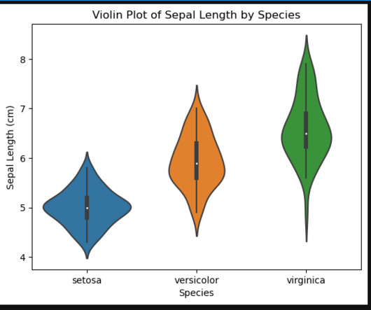
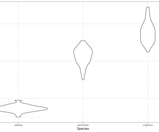
Introduction Datavisualization is an essential skill for anyone who wants to explore and understand large datasets. One of the most popular libraries for datavisualization in Python is Seaborn. In this article, we will focus on understanding how to use Seaborn’s violin plots to visualize the Iris dataset.
We have previously written about the benefits of datavisualization, including its advantages with content marketing. We felt we were overdue for another article on this topic, so we wanted to talk about a particular type of technology that can be beneficial – box plots.
Let’s say you are a data scientist at a top Fortune company, dealing with budget portfolio optimizations worth millions of dollars annually for various clients. It is essential to effectively communicate your […] The post A Picture Is Worth 1,000 Words: The Importance of DataVisualization appeared first on DATAVERSITY.
Violin plots are a visualization technique used to display the distribution of a continuous variable across different levels of a categorical variable. In this article, we will explore how to create violin plots using the ggplot2 package in R. install.packages("ggplot2") library(ggplot2) Next, we need some data to work with.
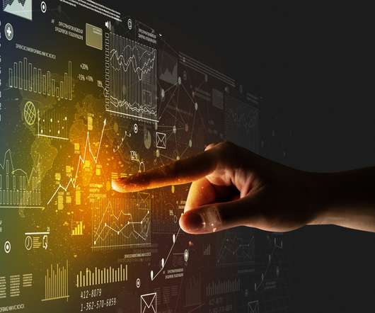
The human brain processes visualdata better than any other kind of data, which is good because about 90% of the information our brains process is visual. Visual processing and responses both occur more quickly compared to other stimuli. This where the power of visualizations is apparent.
Depending on your budget, many different storage solutions can help you streamline your business data. Visualize Your Data. Visualizingdata can be a powerful tool that helps you quickly make sense of complex or large amounts of information. Invest in Data Security.
According to Forbes, Almost eighty-thousand scientific studies attest that visual images promote retention. Graphs, charts with colors, lines and shapes can often tell a story and communicate issues, challenges and opportunities in a business environment. Lets […]
DataVisualization. Did you know visualization has been in use since (and well before that as well) 1824 AD to develop an Egyptian map – the Turin Papyrus Map. With the overwhelming volume and rate at which data grows, it is almost impossible to do it without visual help. Creating Good Visualizations.
Table of Contents 1) The Benefits Of DataVisualization 2) Our Top 27 Best DataVisualizations 3) Interactive DataVisualization: What’s In It For Me? 4) Static vs. Animated DataVisualizationData is the new oil? No, data is the new soil.”
“By visualizing information, we turn it into a landscape that you can explore with your eyes. 90% of the information transmitted to the brain is visual. Concerning professional growth, development, and evolution, using data-driven insights to formulate actionable strategies and implement valuable initiatives is essential.
There are a lot of articles on making presentations about AI technology , such as this article from Medium. Visualizing geographical data with AI not only adds a layer of depth to your presentation but can also significantly enhance audience engagement. Dynamic Infographics Creators Data drives decisions.
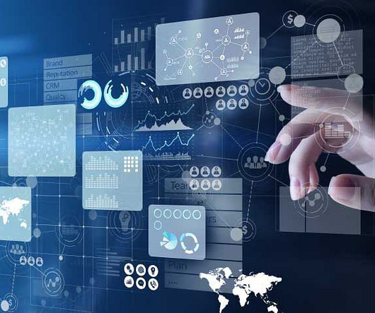
Nowadays, terms like ‘Data Analytics,’ ‘DataVisualization,’ and ‘Big Data’ have become quite popular. In this modern age, each business entity is driven by data. Data analytics are now very crucial whenever there is a decision-making process involved. The Underlying Concept.
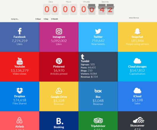
Marketers need to rely heavily on big data technology to reach customers more effectively. Big data technology isn’t just important for making better insights. Visual marketing dashboards are prime examples of using big data effectively in marketing.
During this phase, data is cleaned, analyzed, and assessed. Phase 3: DataVisualization. With the data analyzed and stored in spreadsheets, it’s time to visualize the data so that it can be presented in an effective and persuasive manner. Finally, models are developed to explain the data.
Promoting transparency is possible through seven statistical procedures: Datavisualization Quantifying inferential uncertainty Assessment of data preprocessing choices Reporting multiple models Involving […].
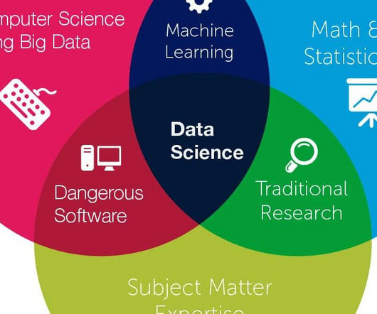
Therefore, machine learning is of great importance for almost any field, but above all, it will work well where there is Data Science. Data Mining Techniques and DataVisualization. Data Mining is an important research process. Data Science vs Data Mining: Concluding Thoughts.
(With enough visualization methods to warrant a periodic table , it can be confusing to know what to use and when—and which visualizations are even worth considering at all. This series of posts is intended to introduce you to the visualization approaches that we find most useful, practical, and audience-friendly.) More from S.
Big data has been at the forefront of the design industry for years. A number of companies have written detailed articles on the utilization of datavisualization with graphics. However, big data can be effective in more rudimentary designs as well.
Microsoft Excel is a versatile spreadsheet software widely used for data entry, analysis, and performing calculations. It also offers powerful tools for datavisualization, allowing users to interpret information and make informed decisions quickly. Read More.
These findings illustrate the benefits of shifting towards a data-driven approach to monitoring employee performance. An article in HR Voices titled Data Analytics in HR: Impacting the Future of Performance Management underscores some of the benefits. They can make some unexpected insights based on data analytics tools.
With the popularity of our list of 20 Best Data Storytelling Examples , we thought it worth finding some more data stories for inspiration. The good examples in this list demonstrate how to combined datavisualization, interactivity, and classic storytelling. of data stories gone wrong.
Forbes contributor Kalev Leetaru recently wrote a fantastic article about the intersection of big data and website hosting. Leetaru notes that big data and cloud technology have led to the evolution of web hosting services. How Big Data is Changing the Future of WordPress. WordPress hosting is a prime example.
From Edward Tufte's Visual Explanations, a diagram based on Salman Rushdie‘s description of the Indian epid Kathasaritsagara or Ocean of the Streams of Story. The hot new concept in datavisualization is "data storytelling"; some are calling it the next evolution of visualization (I'm one of them).
3-D plots are one of the most popular ways to visualizedata. Matlab is a powerful tool for datavisualization and analysis. In this article, we. They give us a way to see the relationships between three variables in a way that is impossible with two-dimensional plots. Read More.
In this article, we’ll dive into the key skills, tools, and techniques that can help you master the art of data analytics. Learn datavisualization techniques Datavisualization is a critical skill for anyone working with data. If you like this article, please have a look at WACAMLDS and SETScholars.
As a SaaS provider, analytical data at Jit needs to be useful to both their customers and to internal stakeholders. AWS services including EventBridge, Kinesis Data Firehose, and Timestream handle data ingestion and UI platforms from Mixpanel and Segment provide datavisualization.
Machine learning and data science are two critical components of business analytics. These technologies have transformed the way businesses operate and make decisions by leveraging data to gain insights and drive growth. DatavisualizationData science techniques can be used to visualize and communicate data insights to stakeholders.
Introduction Power BI is the leading tool for data analytics that is in such an ever-evolving field; it has played out a whole level when talking about datavisualization and business intelligence. Most of the companies all over the different sectors make use of it for the transformation of raw data into meaningful insights.
Basic knowledge of statistics is essential for data science. Statistics is broadly categorized into two types – Descriptive statistics – Descriptive statistics is describing the data. Visual graphs are the core of descriptive statistics. Publish Articles. Publishing gives visibility and recognition.
Last year, we published an article on the ways that big law and big data are intersecting. But things have changed, and seamless software dashboards give critical team members real-time access to the most recent data. Datavisualization methods, such as graphs and charts, reveal trends and insights in an instant.
Data analysts perform this exploratory analysis to understand relationships between variables, check anomalies if any, by using some visualization techniques.Visualizations often involves creating graphs such as scatter plots, histograms andbox plotsto spot trends. DataVisualization Generating charts and graphs to detect patterns.
5) The Role Of Visuals In Accountant Reports. In this article, we will go over the different types of basic accounting reports, why you need them and how you can present them – this last point is crucial in the communication of your financial story, especially when we consider all that is at stake with accountancy. Table of Contents.
We organize all of the trending information in your field so you don't have to. Join 57,000+ users and stay up to date on the latest articles your peers are reading.
You know about us, now we want to get to know you!
Let's personalize your content
Let's get even more personalized
We recognize your account from another site in our network, please click 'Send Email' below to continue with verifying your account and setting a password.


Let's personalize your content