This site uses cookies to improve your experience. To help us insure we adhere to various privacy regulations, please select your country/region of residence. If you do not select a country, we will assume you are from the United States. Select your Cookie Settings or view our Privacy Policy and Terms of Use.
Cookie Settings
Cookies and similar technologies are used on this website for proper function of the website, for tracking performance analytics and for marketing purposes. We and some of our third-party providers may use cookie data for various purposes. Please review the cookie settings below and choose your preference.
Used for the proper function of the website
Used for monitoring website traffic and interactions
Cookie Settings
Cookies and similar technologies are used on this website for proper function of the website, for tracking performance analytics and for marketing purposes. We and some of our third-party providers may use cookie data for various purposes. Please review the cookie settings below and choose your preference.
Strictly Necessary: Used for the proper function of the website
Performance/Analytics: Used for monitoring website traffic and interactions
A 2018 whitepaper from a team of researchers from the University of Copenhagen in Denmark showed that artificial intelligence modeling was more effective at forecasting trends in market prices than conventional benchmarks. You can begin evaluating the results and possibly present them in a visual format.
ElegantJ BI announces its participation in The Vibrant Gujarat StartUp & Technology Summit 2018, October 11 through October 13 at the Helipad Exhibition Centre in Gandhinagar, Gujarat, India. Read More: ElegantJ BI and Smarten Advanced Analytics at The Vibrant Gujarat StartUp & Technology Summit, Oct 11-13, 2018
ElegantJ BI announces its participation in The Vibrant Gujarat StartUp & Technology Summit 2018, October 11 through October 13 at the Helipad Exhibition Centre in Gandhinagar, Gujarat, India. Read More: ElegantJ BI and Smarten Advanced Analytics at The Vibrant Gujarat StartUp & Technology Summit, Oct 11-13, 2018
ElegantJ BI announces its participation in The Vibrant Gujarat StartUp & Technology Summit 2018, October 11 through October 13 at the Helipad Exhibition Centre in Gandhinagar, Gujarat, India. Read More: ElegantJ BI and Smarten Advanced Analytics at The Vibrant Gujarat StartUp & Technology Summit, Oct 11-13, 2018.
The Smarten solution suite includes assisted predictive modeling, smart data visualization and self-service data preparation – all designed to transform business users into Citizen Data Scientists.
The Smarten solution suite includes assisted predictive modeling, smart data visualization and self-service data preparation – all designed to transform business users into Citizen Data Scientists.
The Smarten solution suite includes assisted predictive modeling, smart data visualization and self-service data preparation – all designed to transform business users into Citizen Data Scientists. Published: 29 October 2018 ID: G00369983. About Smarten.
Data Visualization : Presenting insights via dashboards or graphs using tools like Tableau or Power BI, enabling decision-makers to act on data effectively. Data Storage : Using scalable technologies like Hadoop or cloud storage to handle vast datasets.
In 2018, Blake Morgan wrote an article in Forbes detailing how Amazon rebranded itself around AI. AI helps companies create higher quality visuals for their ads. Therefore, it is no surprise that the market for AI-enabled ecommerce services is projected to be worth nearly $17 billion by 2030. Increase Views With Google.
In 2018 alone, 2,258 website accessibility lawsuits were filed in federal court. The new rule began taking effect in 2018, but many organizations are still not familiar with the new policies. These include: New accessibility plugins for people with visual impairments. These plugins can resize text and alter colors.
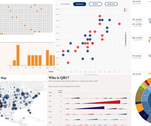
Sarah Molina February 10, 2023 - 8:42pm February 13, 2023 Win-loss margins, receiver routes, fan maps, game predictions—the list goes on for ways the game of American football can be visualized. See the curated collection below showcasing some incredible American football vizzes from the Tableau Community.
Sarah Molina February 10, 2023 - 8:42pm February 13, 2023 Win-loss margins, receiver routes, fan maps, game predictions—the list goes on for ways the game of American football can be visualized. See the curated collection below showcasing some incredible American football vizzes from the Tableau Community.
ElegantJ BI, an innovative vendor in Business Intelligence, Augmented Analytics and Augmented Data Preparation, is pleased to announce its participation in the Gartner 2018 INDIA Data & Analytics Summit from 5 – 6th June 2018 in Mumbai, India. ElegantJ BI is proud to be a Silver Sponsor at this important event.
ElegantJ BI, an innovative vendor in Business Intelligence, Augmented Analytics and Augmented Data Preparation, is pleased to announce its participation in the Gartner 2018 INDIA Data & Analytics Summit from 5 – 6th June 2018 in Mumbai, India. ElegantJ BI is proud to be a Silver Sponsor at this important event.
ElegantJ BI, an innovative vendor in Business Intelligence, Augmented Analytics and Augmented Data Preparation, is pleased to announce its participation in the Gartner 2018 INDIA Data & Analytics Summit from 5 – 6th June 2018 in Mumbai, India. ElegantJ BI is proud to be a Silver Sponsor at this important event.
These AI algorithms understand users’ inputs to create visually stunning designs based on those preferences and needs. To put that in perspective, at the end of 2018, there were 2.5 One of the more surprising AI developments seen in the digital marketing world was the rise of AI design. Voice recognition.
Books we read in 2018. A Visual Journal Diary - Journal follow up to Dear Data with some cool conversation topics. MakeoverMonday: Improving How We Visualize and Analyze Data, One Chart at a Time - A beautiful summary of the MakeoverMonday weekly project. A book and apparel line in 2018. Happy Holidays! New Books We Love.
Big news for analytic app builders looking to make their visuals even more compelling: Sisense has an Adobe XD plugin that lets them create custom visualizations for their Sisense BloX widgets with zero code. One of the first ways to visualize data was through VisiCalc (1979), then Lotus (1983), and finally Excel sheets (1987).
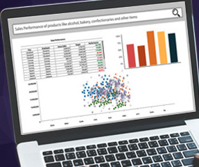
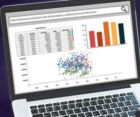
If you are a sales manager, you might use this NLP feature to ask your Augmented Analytics ‘which Southwestern region sales person sold the most units of tea products in September of 2018?’. With natural language-processing-based search capability, users can avoid menus and scrolling and get right to the heart of the question (and answer).
If you are a sales manager, you might use this NLP feature to ask your Augmented Analytics ‘which Southwestern region sales person sold the most units of tea products in September of 2018?’. With natural language-processing-based search capability, users can avoid menus and scrolling and get right to the heart of the question (and answer).
If you are a sales manager, you might use this NLP feature to ask your Augmented Analytics ‘which Southwestern region sales person sold the most units of tea products in September of 2018?’. With natural language-processing-based search capability, users can avoid menus and scrolling and get right to the heart of the question (and answer).
The Gartner report entitled, ‘Augmented Analytics Is the Future of Data and Analytics, published on October 31, 2018, includes the following strategic assumptions: By 2020, augmented analytics will be a dominant driver of new purchases of analytics and BI as well as data science and machine learning platforms, and of embedded analytics.
The Gartner report entitled, ‘Augmented Analytics Is the Future of Data and Analytics, published on October 31, 2018, includes the following strategic assumptions: By 2020, augmented analytics will be a dominant driver of new purchases of analytics and BI as well as data science and machine learning platforms, and of embedded analytics.
The Gartner report entitled, ‘Augmented Analytics Is the Future of Data and Analytics, published on October 31, 2018, includes the following strategic assumptions: By 2020, augmented analytics will be a dominant driver of new purchases of analytics and BI as well as data science and machine learning platforms, and of embedded analytics.
On Saturday, 9th June 2018, we announced the existence of Power BI Documenter. As the name resembles, Power BI Documenter is a tool to help individuals and businesses to document their Power BI Desktop models.
For the first time since I retired from teaching data visualization workshops in 2018, Nick Desbarats of Practical Reporting Inc. will be teaching my courses publicly in the United States.
For example, you might ask ‘What is the best performing product in all states for 2018 as compared to 2017’ Simple, right? Ask a simple question, using natural language. You just type in the question and the system does the analysis using natural language processing. If this sounds good to you, I can tell you how to get started.
For example, you might ask ‘What is the best performing product in all states for 2018 as compared to 2017’ Simple, right? Ask a simple question, using natural language. You just type in the question and the system does the analysis using natural language processing. If this sounds good to you, I can tell you how to get started.
For example, you might ask ‘What is the best performing product in all states for 2018 as compared to 2017’ Simple, right? Ask a simple question, using natural language. You just type in the question and the system does the analysis using natural language processing. If this sounds good to you, I can tell you how to get started.
Working with a group of visionary educators, we’ve been able to achieve amazing milestones, such as introducing Tableau to all first year students at Nanyang Technological University in Singapore in 2018. In partnership with AICTE, we will help equip the future workforce of India with these critical data skills.
Click to view the full interactive visualization. VizQL: A domain-specific language for visual, self-service analysis. The core innovation in Chris’ prototype was a domain-specific language called VizQL that combined query and visual encoding of data. The Cycle of Visual Analysis. Release v1.0
They can simply enter a search query in natural language and the system will translate the query, and return the results in natural language in an appropriate form, such as visualization, tables, numbers or descriptions.
The Gartner report entitled, ‘Augmented Analytics Is the Future of Data and Analytics, published on October 31, 2018, includes the following strategic assumptions: By 2025, a scarcity of data scientists will no longer hinder the adoption of data science and machine learning in organizations.
Heat and Tree Maps We are going to look at two important visualizations which are used in many different fields for analysis. Heat Maps In these visualizations, the color shade of areas varies as per the values in the data. They are great for visualizing statistical data as well.
Augmented Analytics includes Assisted Predictive Modeling, Smart Data Visualization, Self-Serve Data Preparation, Clickless Analytics, NLP Search Analytics, Automated Machine Learning (AutoML), which enables faster, or accurate analysis across the organization, optimizes resources and improves the value of each team member.
Augmented Analytics includes Assisted Predictive Modeling, Smart Data Visualization, Self-Serve Data Preparation, Clickless Analytics, NLP Search Analytics, Automated Machine Learning (AutoML), which enables faster, or accurate analysis across the organization, optimizes resources and improves the value of each team member.
Augmented Analytics includes Assisted Predictive Modeling, Smart Data Visualization, Self-Serve Data Preparation, Clickless Analytics, NLP Search Analytics, Automated Machine Learning (AutoML), which enables faster, or accurate analysis across the organization, optimizes resources and improves the value of each team member.
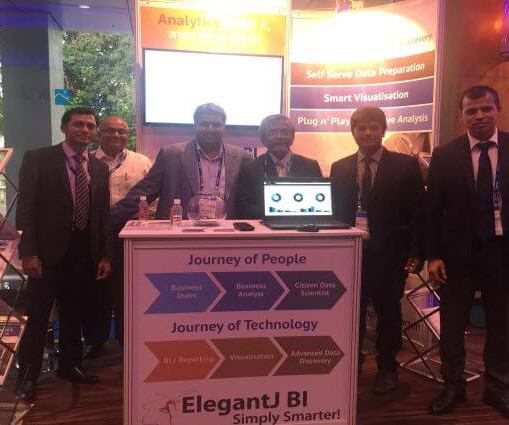
Healthy options are always appreciated and I would encourage the Gartner team to add to the choices for the 2018 Summit. We had a great response, especially with our Smarten Advanced Data Discovery with self serve data prep, smart visualization and plug n’ play predictive analytics. I want to thank those who visited our booth.
Healthy options are always appreciated and I would encourage the Gartner team to add to the choices for the 2018 Summit. We had a great response, especially with our Smarten Advanced Data Discovery with self serve data prep, smart visualization and plug n’ play predictive analytics. I want to thank those who visited our booth.
Healthy options are always appreciated and I would encourage the Gartner team to add to the choices for the 2018 Summit. We had a great response, especially with our Smarten Advanced Data Discovery with self serve data prep, smart visualization and plug n’ play predictive analytics. I want to thank those who visited our booth.
We organize all of the trending information in your field so you don't have to. Join 57,000+ users and stay up to date on the latest articles your peers are reading.
You know about us, now we want to get to know you!
Let's personalize your content
Let's get even more personalized
We recognize your account from another site in our network, please click 'Send Email' below to continue with verifying your account and setting a password.


Let's personalize your content