This site uses cookies to improve your experience. To help us insure we adhere to various privacy regulations, please select your country/region of residence. If you do not select a country, we will assume you are from the United States. Select your Cookie Settings or view our Privacy Policy and Terms of Use.
Cookie Settings
Cookies and similar technologies are used on this website for proper function of the website, for tracking performance analytics and for marketing purposes. We and some of our third-party providers may use cookie data for various purposes. Please review the cookie settings below and choose your preference.
Used for the proper function of the website
Used for monitoring website traffic and interactions
Cookie Settings
Cookies and similar technologies are used on this website for proper function of the website, for tracking performance analytics and for marketing purposes. We and some of our third-party providers may use cookie data for various purposes. Please review the cookie settings below and choose your preference.
Strictly Necessary: Used for the proper function of the website
Performance/Analytics: Used for monitoring website traffic and interactions
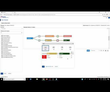
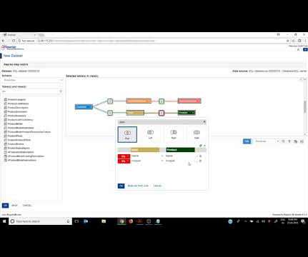
The traditional definition of data preparation describes an iterative process, typically executed by IT staff or analysts to extract and transform raw data so that the data can be used for discovery, analytics and reporting.
The traditional definition of data preparation describes an iterative process, typically executed by IT staff or analysts to extract and transform raw data so that the data can be used for discovery, analytics and reporting.
The traditional definition of data preparation describes an iterative process, typically executed by IT staff or analysts to extract and transform raw data so that the data can be used for discovery, analytics and reporting.
NLQ serves those users who are in a rush, or who lack the skills or permissions to model their data using visualization tools or code editors. In this mode, the user avoids putting too much effort into the definition of a specific search, and instead, relies on a random exploration path with the assisted exploration of NLQ.
I’ve written a new book, titled Big Data, Big Dupe , which will be published on February 1, 2018. Here’s the table of contents: As you can see, unlike my four other books, this is not about data visualization, but it is definitely relevant to all of us who are involved in data sensemaking.
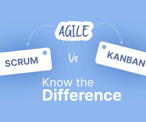
So, before discussing their differences, let us take a look at the definitions. Scrum vs. Kanban: The Definitions. Kanban is a workflow management framework that visualizes your work, improves it, and maximizes efficiency. In the Kanban framework, the work items are visually represented on a Kanban board. Sprint Planning.
Let’s start with a simple definition. It is common to use the term dashboard scorecard since the two can be interconnected, as mentioned, but here is a visual summary of scorecards vs dashboards to get a clearer overview of the differences: **click to enlarge**. Let’s see this through a visual example. What Is A KPI Scorecard?
In fact, according to our 2017-2018 Enterprise UX Industry Report , 69% of the thousands polled said they either already implemented a design system, or were currently building one. Grid definitions. Icon usage is highly susceptible to inconsistency, so now’s your chance to make a definitive library. Enter the design system.
Visualizing the risks . Kelly and her team at Headwaters Economics used Tableau to create two powerful dashboards to visualize the inequitable realities of wildfire risk and help decision makers find solutions. In both of these visualizations, it’s important to recognize overlapping vulnerabilities. Expanding on lessons learned.
Whether covering data science, big data, online data visualization , or data analytics, publications centered on BI and dashboard design are piling up in bookstores around the globe. Definitely, a valuable business intelligence roadmap book to add to your library. . “Data is what you need to do analytics. click for book source**.
The first in our definitive rundown of tech buzzwords 2020 is computer vision. Exciting and futuristic, the concept of computer vision is based on computing devices or programs gaining the ability to extract detailed information from visual images. Get the inside scoop and learn all the new buzzwords in tech for 2020! Computer Vision.
Visualizing the risks. Kelly and her team at Headwaters Economics used Tableau to create two powerful dashboards to visualize the inequitable realities of wildfire risk and help decision makers find solutions. In both of these visualizations, it’s important to recognize overlapping vulnerabilities. Expanding on lessons learned.
Spreadsheets finally took a backseat to actionable and insightful data visualizations and interactive business dashboards. Companies are no longer wondering if data visualizations improve analyses but what is the best way to tell each data-story. 2) Data Discovery/Visualization. Data exploded and became big.
The data from the API is also quite raw and we had to go find definitions for all the NOAA weather types and station information. These types of visuals are great with Domo’s interactive page filters so I can for example click on Idaho in the top map and the rest of the maps will zoom in and I can see details on weather stations or counties.
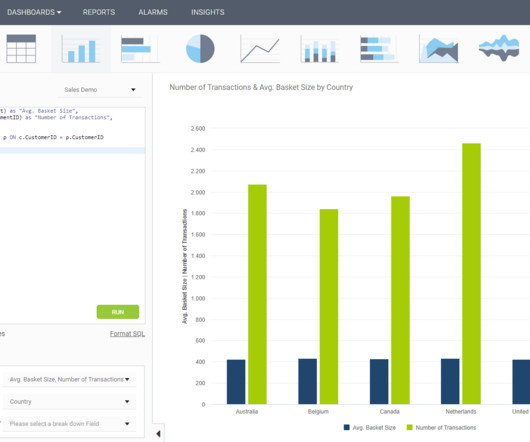
In some cases, you will need a coding solution where you can build your own queries, but in others, you will also look for a visual representation of your realational data. How To Create SQL Dashboards – Coding & Visuals. The good news is that you can utilize both with the help of a modern and professional SQL dashboard.
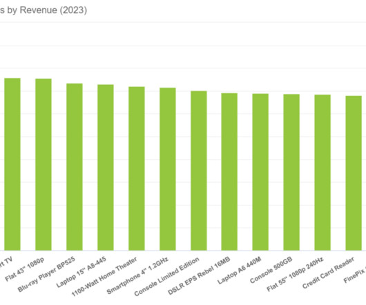
2) Pros & Cons Of Bar Charts 3) When To Use A Bar Graph 4) Types Of Bar Charts 5) Bar Graphs & Charts Best Practices 6) Bar Chart Examples In today’s fast-paced analytical landscape, data visualization has become one of the most powerful tools organizations can benefit from to be successful with their analytical efforts.
Companies planning to scale their business in the next few years without a definite cloud strategy might want to reconsider. Microsoft also releases Power BI, a data visualization and business intelligence tool. 2018: IoT and edge computing open up new opportunities for organizations. What’s so special about the Cloud?
According to the 2018 Salary Survey by Zip Recruiter , the average salary an AWS Solutions Architect can earn is $167,500. According to the 2018 Salary Survey by Zip Recruiter , the average salary an AWS Developer can earn is $122,500. Capability to define and guide best practices for implementing the architecture of AWS applications.
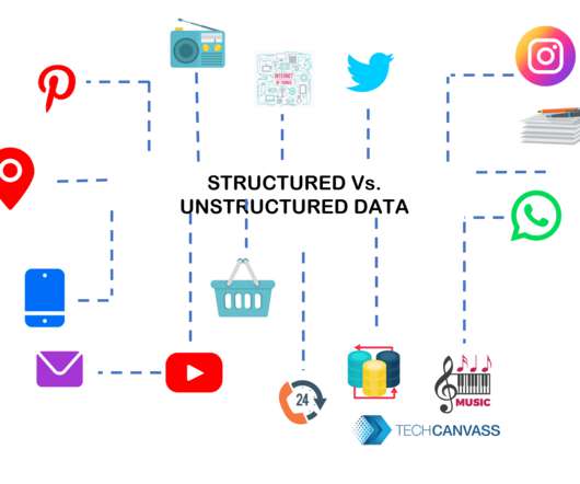
IDC predicts that the Global Data sphere will grow from 33 Zettabytes (ZB) in 2018 to 175 ZB by 2025! Unstructured data has no definite structure or data model and is stored in its native format. If the review contains a mix of text, audio, and visuals, it cannot be stored in a database. Variety in Data. Source: IDC Seagate.
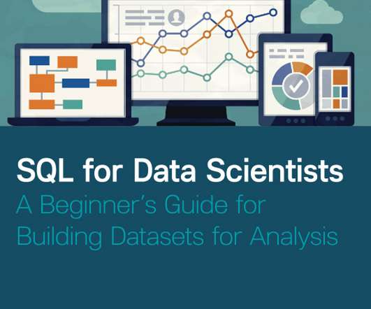
We have already given you our top data visualization books , top business intelligence books , and best data analytics books. Definitely, one of the best books for SQL beginners! Originally published in 2018, the book has a second edition that was released in January of 2022. stars rating on Amazon so far.
So, before discussing their differences, let us take a look at the definitions. Scrum vs. Kanban: The Definitions. Kanban is a workflow management framework that visualizes your work, improves it, and maximizes efficiency. In the Kanban framework, the work items are visually represented on a Kanban board. Sprint Planning.
In case you are looking to move into a full-time position as a business analyst, your past experience will definitely be an advantage in some manner. 14% of job vacancies from the US Bureau of Labor Statistics 2018 to 2028. Also, do practice and visualize. to adapt business analysis activities within the specific methodology.
He has hit 3000 blog posts for the AWS blog in 2018. The engineering team he leads is responsible for building and maintaining Microsoft Azure, Dynamics 365, Windows/Windows Server, HoloLens, Visual Studio/Visual Studio Code, GitHub, SQL Server, and Power BI. . Follow Scott Guthrie on Twitter , LinkedIn , and Blog/Website.
Interest is definitely there. People speak about it and are definitely interested. In 2024, only 43 people received IIBA-AAC certification, according to the IIBA Directory – the one introduced by IIBA in 2018. There is a definite value in learning and getting the knowledge. I cannot say it was that much in 2023.
Let’s start by exploring a financial reporting definition. Now that we’ve explored what we consider to be the ‘financial reporting meaning’ or financial reporting definition, let’s glance at the benefits of these kinds of reports. What Is Financial Reporting? The Benefits Of Financial Reporting. 2) Balance sheet.
We organize all of the trending information in your field so you don't have to. Join 57,000+ users and stay up to date on the latest articles your peers are reading.
You know about us, now we want to get to know you!
Let's personalize your content
Let's get even more personalized
We recognize your account from another site in our network, please click 'Send Email' below to continue with verifying your account and setting a password.


Let's personalize your content