This site uses cookies to improve your experience. To help us insure we adhere to various privacy regulations, please select your country/region of residence. If you do not select a country, we will assume you are from the United States. Select your Cookie Settings or view our Privacy Policy and Terms of Use.
Cookie Settings
Cookies and similar technologies are used on this website for proper function of the website, for tracking performance analytics and for marketing purposes. We and some of our third-party providers may use cookie data for various purposes. Please review the cookie settings below and choose your preference.
Used for the proper function of the website
Used for monitoring website traffic and interactions
Cookie Settings
Cookies and similar technologies are used on this website for proper function of the website, for tracking performance analytics and for marketing purposes. We and some of our third-party providers may use cookie data for various purposes. Please review the cookie settings below and choose your preference.
Strictly Necessary: Used for the proper function of the website
Performance/Analytics: Used for monitoring website traffic and interactions
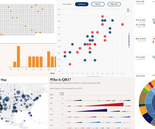
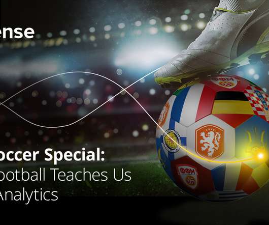
Sarah Molina February 10, 2023 - 8:42pm February 13, 2023 Win-loss margins, receiver routes, fan maps, game predictions—the list goes on for ways the game of American football can be visualized. See the curated collection below showcasing some incredible American football vizzes from the Tableau Community.
Sarah Molina February 10, 2023 - 8:42pm February 13, 2023 Win-loss margins, receiver routes, fan maps, game predictions—the list goes on for ways the game of American football can be visualized. See the curated collection below showcasing some incredible American football vizzes from the Tableau Community.
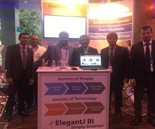
ElegantJ BI announces its participation in The Vibrant Gujarat StartUp & Technology Summit 2018, October 11 through October 13 at the Helipad Exhibition Centre in Gandhinagar, Gujarat, India. Read More: ElegantJ BI and Smarten Advanced Analytics at The Vibrant Gujarat StartUp & Technology Summit, Oct 11-13, 2018
ElegantJ BI announces its participation in The Vibrant Gujarat StartUp & Technology Summit 2018, October 11 through October 13 at the Helipad Exhibition Centre in Gandhinagar, Gujarat, India. Read More: ElegantJ BI and Smarten Advanced Analytics at The Vibrant Gujarat StartUp & Technology Summit, Oct 11-13, 2018
ElegantJ BI announces its participation in The Vibrant Gujarat StartUp & Technology Summit 2018, October 11 through October 13 at the Helipad Exhibition Centre in Gandhinagar, Gujarat, India. Read More: ElegantJ BI and Smarten Advanced Analytics at The Vibrant Gujarat StartUp & Technology Summit, Oct 11-13, 2018.
Data Storage : Using scalable technologies like Hadoop or cloud storage to handle vast datasets. Data Processing : Cleaning and transforming raw data through statistical analysis, machine learning, or natural language processing.
Visualization credit: Police Scorecard. The underlying dataset for Police Scorecard is massive: over 13 million cells of data and counting. To provide a way into understanding it, Sinyangwe and his team relied on Tableau datavisualizations to highlight key trends in the data. The role of visualization.
But why Datavisualization? In this article, I am going to examine Why do Business Analysts need to learn Datavisualization skills? This report suggests that, in 2020, the job requirements for data science and analytics is projected to boom to by 364,000 openings to 2,720,000. Visualizations help in finding out.
Visualization credit: Police Scorecard. The underlying dataset for Police Scorecard is massive: over 13 million cells of data and counting. To provide a way into understanding it, Sinyangwe and his team relied on Tableau datavisualizations to highlight key trends in the data. The role of visualization.
These are some of our favorite books and gift ideas for the data scientist, designer or analyst in your life. Books we read in 2018. A Visual Journal Diary - Journal follow up to Dear Data with some cool conversation topics. Classic Data Books. A book and apparel line in 2018. Happy Holidays!
The Gartner report entitled, ‘Augmented Analytics Is the Future of Data and Analytics, published on October 31, 2018, includes the following strategic assumptions: By 2025, a scarcity of data scientists will no longer hinder the adoption of data science and machine learning in organizations.
The Gartner report entitled, ‘Augmented Analytics Is the Future of Data and Analytics, published on October 31, 2018, includes the following strategic assumptions: By 2025, a scarcity of data scientists will no longer hinder the adoption of data science and machine learning in organizations.
The Gartner report entitled, ‘Augmented Analytics Is the Future of Data and Analytics, published on October 31, 2018, includes the following strategic assumptions: By 2025, a scarcity of data scientists will no longer hinder the adoption of data science and machine learning in organizations.
Sisense News is your home for new Sisense features, add-ons, and everything else we roll out to empower our users to get the most out of their data. One of the first ways to visualizedata was through VisiCalc (1979), then Lotus (1983), and finally Excel sheets (1987). A love story between Sisense BloX and Adobe XD.
Healthy options are always appreciated and I would encourage the Gartner team to add to the choices for the 2018 Summit. We had a great response, especially with our Smarten Advanced Data Discovery with self serve data prep, smart visualization and plug n’ play predictive analytics.
Healthy options are always appreciated and I would encourage the Gartner team to add to the choices for the 2018 Summit. We had a great response, especially with our Smarten Advanced Data Discovery with self serve data prep, smart visualization and plug n’ play predictive analytics.
Healthy options are always appreciated and I would encourage the Gartner team to add to the choices for the 2018 Summit. We had a great response, especially with our Smarten Advanced Data Discovery with self serve data prep, smart visualization and plug n’ play predictive analytics.
There are many options for learning, including this list of best data storytelling workshops and absorbing the lessons of masters from 20 amazing data storytelling examples. By the end of the course, learners will have the skills needed to produce impactful datavisualizations layered with compelling narratives.
For the first time since I retired from teaching datavisualization workshops in 2018, Nick Desbarats of Practical Reporting Inc. will be teaching my courses publicly in the United States.
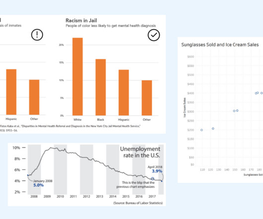
Alberto Cairo, datavisualization expert and author of How Charts Lie Whether you are reading a social post, news article or business report, it’s important to know and evaluate the source of the data and charts that you view. Two line graphs showing the same data with different intervals on the axis. Know the Source.
Similar to the advancements in telescope technology, datavisualizations 10 years ago were no where near the art they’ve become today. Vizzes advance as the industry learns more about accessibility and human cognition, and as improved data literacy pushes the world to be more data driven. Go TEAM DATA!
On Saturday, 9th June 2018, we announced the existence of Power BI Documenter. As the name resembles, Power BI Documenter is a tool to help individuals and businesses to document their Power BI Desktop models.
Similar to the advancements in telescope technology, datavisualizations 10 years ago were no where near the art they’ve become today. Vizzes advance as the industry learns more about accessibility and human cognition, and as improved data literacy pushes the world to be more data driven. Go TEAM DATA!
One thing that Nancy knows is that data communication isn’t just about datavisualization — any more than a movie is just about moving images. She makes this point in a recent HBR article The more data we collect, the more mind-boggling these figures become. — Neil deGrasse Tyson (@neiltyson) May 12, 2018.
I’ve written a new book, titled Big Data, Big Dupe , which will be published on February 1, 2018. As the title suggests, it is an exposé on Big Data—one that is long overdue. It’s a marketing campaign that has distracted us for years from the real and important work of deriving value from data.
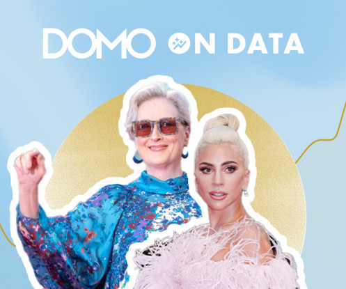
There’s “A Star Is Born,” which was made in 2018 with Lady Gaga, of course, but also versions released in 1976, 1954, and 1937. Different films, same name and story, over and over. At first, my viz showed “A Star Is Born” as having the most nominations. But that movie was made at four different times.
On Saturday, 9th June 2018, we announced the existence of Power BI Documenter. As the name resembles, Power BI Documenter is a tool to help individuals and businesses to document their Power BI Desktop models.
2) Pros & Cons Of Bar Charts 3) When To Use A Bar Graph 4) Types Of Bar Charts 5) Bar Graphs & Charts Best Practices 6) Bar Chart Examples In today’s fast-paced analytical landscape, datavisualization has become one of the most powerful tools organizations can benefit from to be successful with their analytical efforts.
The data points related to users/players reside across multiple channels and platforms i.e. websites, apps, CRMs, Ad networks, and financial software. A data management strategy including business intelligence (BI) tools, datavisualization software, and a data warehouse, maybe good ideas to consider.
Tableau lets you visualize and explore all of your data without having to write code or premeditate your vizzes and dashboards. We also reached some incredible milestones with Tableau Prep, our easy-to-use, visual, self-service data prep product. Read the 2021 report for Gartner analysis.
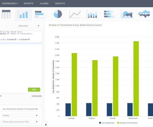
In some cases, you will need a coding solution where you can build your own queries, but in others, you will also look for a visual representation of your realational data. How To Create SQL Dashboards – Coding & Visuals. But let’s start from the beginning and define this kind of a dashboard. SQL Chart Creation.
Exciting and futuristic, the concept of computer vision is based on computing devices or programs gaining the ability to extract detailed information from visual images. Visual analytics: Around three million images are uploaded to social media every single day. Artificial Intelligence (AI).
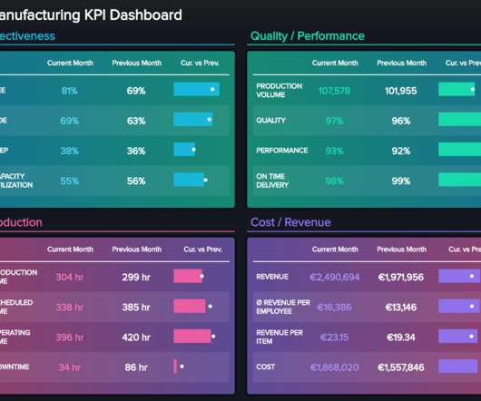
It is common to use the term dashboard scorecard since the two can be interconnected, as mentioned, but here is a visual summary of scorecards vs dashboards to get a clearer overview of the differences: **click to enlarge**. Let’s see this through a visual example. Balanced scorecard – how is my company performing? click to enlarge**.
With ‘big data’ transcending one of the biggest business intelligence buzzwords of recent years to a living, breathing driver of sustainable success in a competitive digital age, it might be time to jump on the statistical bandwagon, so to speak. Making this publication one of the greatest business data analytics books out there.
July 5, 2018 - 9:55pm. While there is no single way to accelerate your data skills, all roads lead through the Tableau Community. Within the Community, you’ll find a collection of resources and activities designed to further your data journey and connect you with like-minded people. . Andrew Grinaker. Marissa Michelotti.
July 5, 2018 - 9:55pm. While there is no single way to accelerate your data skills, all roads lead through the Tableau Community. Within the Community, you’ll find a collection of resources and activities designed to further your data journey and connect you with like-minded people. . Andrew Grinaker. Marissa Michelotti.
Microsoft also releases Power BI, a datavisualization and business intelligence tool. 2018: IoT and edge computing open up new opportunities for organizations. Edge computing is the process of decentralizing computer services and shifting them closer to the data source. He puts forth a mobile-first, cloud-first strategy.
These types of insights are mainly gathered from playing logs, video and GPS tracking, and spatially related data. Heat map datavisualizations have shown teams that keep possession of the ball and maintain high intensity are most likely to score goals and win games. Example of Sisense player performance dashboard.
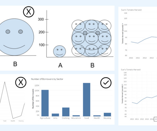
The key is to think critically and take time to evaluate the interpretations of data portrayed in charts. DataVisualization expert and author Kathy Rowell says that we should always ask “Compared to What?” For example, in How Charts Lie: Getting Smarter about Visual Information , Alberto Cairo discusses the following bar chart.
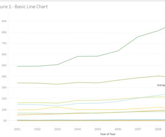
Line charts are usually required for comparisons or visualizing trends between data points. Let us look at another example data set, which contains data about arrival and departure domestic and international passenger traffic from various terminals from the LA airport from 2006 to 2018. The implication of figure 2.
We are just weeks away from Tableau Conference and the ultimate visualization showdown —Iron Viz 2021—where three fierce contestants will take the virtual stage for an intense lightning round of live viz-tastic storytelling. . Pradeep Kumar G : I have been entering Iron Viz since 2018 (feeder 3). Ateken Abla. October 11, 2021 - 5:30pm.
We are just weeks away from Tableau Conference and the ultimate visualization showdown —Iron Viz 2021—where three fierce contestants will take the virtual stage for an intense lightning round of live viz-tastic storytelling. . Pradeep Kumar G : I have been entering Iron Viz since 2018 (feeder 3). Ateken Abla. October 11, 2021 - 5:30pm.
Business leaders, developers, data heads, and tech enthusiasts – it’s time to make some room on your business intelligence bookshelf because once again, datapine has new books for you to add. We have already given you our top datavisualization books , top business intelligence books , and best data analytics books.
When Brian Jackson joined Texas Tech Credit Union as its business intelligence director in 2018, one of the first things he did was take inventory of all the financial institution’s systems and how they were working together. What he found was the equivalent of a giant vault, waiting to be unlocked. We are now at 95% integration,” Brian said.
We organize all of the trending information in your field so you don't have to. Join 57,000+ users and stay up to date on the latest articles your peers are reading.
You know about us, now we want to get to know you!
Let's personalize your content
Let's get even more personalized
We recognize your account from another site in our network, please click 'Send Email' below to continue with verifying your account and setting a password.


Let's personalize your content