This site uses cookies to improve your experience. To help us insure we adhere to various privacy regulations, please select your country/region of residence. If you do not select a country, we will assume you are from the United States. Select your Cookie Settings or view our Privacy Policy and Terms of Use.
Cookie Settings
Cookies and similar technologies are used on this website for proper function of the website, for tracking performance analytics and for marketing purposes. We and some of our third-party providers may use cookie data for various purposes. Please review the cookie settings below and choose your preference.
Used for the proper function of the website
Used for monitoring website traffic and interactions
Cookie Settings
Cookies and similar technologies are used on this website for proper function of the website, for tracking performance analytics and for marketing purposes. We and some of our third-party providers may use cookie data for various purposes. Please review the cookie settings below and choose your preference.
Strictly Necessary: Used for the proper function of the website
Performance/Analytics: Used for monitoring website traffic and interactions
ElegantJ BI, a leading vendor in Business Intelligence and Advanced Analytics solutions, is pleased to announce that it is listed for its suite in the Gartner ‘Other Vendors to Consider for Modern BI and Analytics’ report published August 4, 2017. Sallam, Cindi Howson, Carlie J. Oestreich, Shubhangi Vashisth.
Smart DataVisualization can radically improve your business intelligence, data discovery and analytics. What is Smart DataVisualization? Smart Visualization tools allow users to gather various data components and tell a story. Can Smart DataVisualization Make Business Users Smarter?
Smart DataVisualization can radically improve your business intelligence, data discovery and analytics. What is Smart DataVisualization? Smart Visualization tools allow users to gather various data components and tell a story. Can Smart DataVisualization Make Business Users Smarter?
Smart DataVisualization can radically improve your business intelligence, data discovery and analytics. What is Smart DataVisualization? Smart Visualization tools allow users to gather various data components and tell a story. Can Smart DataVisualization Make Business Users Smarter?
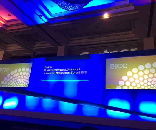
On June 6 and 7, 2017, I had the pleasure of attending and participating in the Gartner Business Intelligence, Analytics and Information Management Summit in Powai, Mumbai, India. The 2017 Summit was larger and even more productive than the Summit of 2016, with more than 650 delegates in attendance.
On June 6 and 7, 2017, I had the pleasure of attending and participating in the Gartner Business Intelligence, Analytics and Information Management Summit in Powai, Mumbai, India. The 2017 Summit was larger and even more productive than the Summit of 2016, with more than 650 delegates in attendance.
On June 6 and 7, 2017, I had the pleasure of attending and participating in the Gartner Business Intelligence, Analytics and Information Management Summit in Powai, Mumbai, India. The 2017 Summit was larger and even more productive than the Summit of 2016, with more than 650 delegates in attendance.
By analyzing big data, Edutech businesses discover interesting ways to revolutionize learning as we know it. Year after year, the volume of data in eLearning (and the need to analyze it) increases. In 2017, 77% of U.S. Big data analytics’ influence is two-sided as well. between 2022 and 2030.
Although SageMaker has become a popular hardware accelerator since it was launched in 2017, there are plenty of other overlooked hardware accelerators on the market. If you want to streamline various parts of the data science development process, then you should be aware of all of your options. Neptune.ai. Neptune.AI
“By visualizing information, we turn it into a landscape that you can explore with your eyes. 90% of the information transmitted to the brain is visual. Concerning professional growth, development, and evolution, using data-driven insights to formulate actionable strategies and implement valuable initiatives is essential.
Data Storage : Using scalable technologies like Hadoop or cloud storage to handle vast datasets. Data Processing : Cleaning and transforming raw data through statistical analysis, machine learning, or natural language processing.
ElegantJ BI, a leading vendor in Business Intelligence and Advanced Analytics solutions, is pleased to announce that it is listed for its suite in the Gartner ‘Other Vendors to Consider for Modern BI and Analytics’ report published August 4, 2017. Sallam, Cindi Howson, Carlie J. Oestreich, Shubhangi Vashisth.
ElegantJ BI, a leading vendor in Business Intelligence and Advanced Analytics solutions, is pleased to announce that it is listed for its suite in the Gartner ‘Other Vendors to Consider for Modern BI and Analytics’ report published August 4, 2017. Sallam, Cindi Howson, Carlie J. Oestreich, Shubhangi Vashisth.
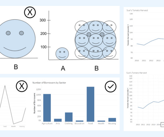
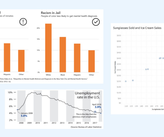
Alberto Cairo, datavisualization expert and author of How Charts Lie Whether you are reading a social post, news article or business report, it’s important to know and evaluate the source of the data and charts that you view. Two line graphs showing the same data with different intervals on the axis. Know the Source.
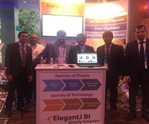
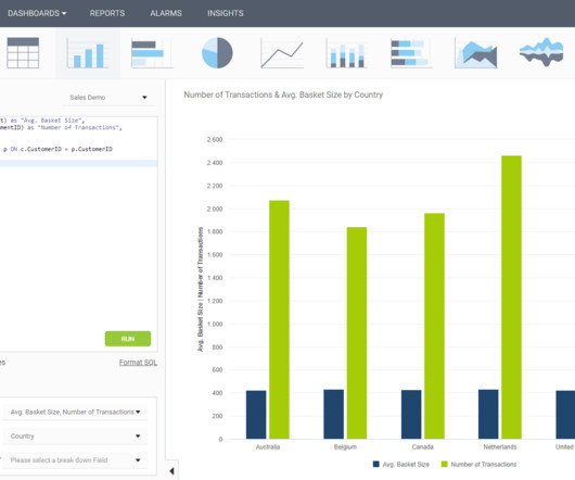
We had a great response, especially with our Advanced Data Discovery with self serve data prep, smart visualization and plug n’ play predictive analytics. The ElegantJ BI booth was REALLY BUSY. We greeted customers, stakeholders, and partners and provided an update on business. I want to thank those who visited our booth.
We had a great response, especially with our Advanced Data Discovery with self serve data prep, smart visualization and plug n’ play predictive analytics. The ElegantJ BI booth was REALLY BUSY. We greeted customers, stakeholders, and partners and provided an update on business. I want to thank those who visited our booth.
Kurt Schlegel discussed the next big disruption, ‘Self Serve Data Prep from Shadow IT to Citizen Data Science’ Rick Greenwald’s session was concise and to the point, ‘Spark: The Future of Data Analytics’ Unfortunately, Gartner Analyst, Rita Sallam , wasn’t able to attend, but I am anxious to attend her session in 2017!
“Being a Tableau Ambassador allows me to help others learn Tableau and empower them with analytics and datavisualization skills. Gurpreet Singh is Data Analytics & Visualization lead, certified Tableau Desktop specialist and analytics content creator with 15+ years of experience in Information Technology.
Advanced Analytics allows the organization to leverage Advanced Data Discovery features and enjoy the benefits of a truly intelligent solution that suggests relationships, identifies patterns, suggests visualization techniques and formats, highlights trends and patterns, and presents predictions.
Advanced Analytics allows the organization to leverage Advanced Data Discovery features and enjoy the benefits of a truly intelligent solution that suggests relationships, identifies patterns, suggests visualization techniques and formats, highlights trends and patterns, and presents predictions.
Advanced Analytics allows the organization to leverage Advanced Data Discovery features and enjoy the benefits of a truly intelligent solution that suggests relationships, identifies patterns, suggests visualization techniques and formats, highlights trends and patterns, and presents predictions.
Tableau lets you visualize and explore all of your data without having to write code or premeditate your vizzes and dashboards. We also reached some incredible milestones with Tableau Prep, our easy-to-use, visual, self-service data prep product. Read the 2021 report for Gartner analysis.
Today, data specialists are no longer the only ones being tasked with creating various data compositions such as data presentations, reports, dashboards, infographics, datavisualizations, and so on. Data stories are powerful vehicles for sharing data insights to influence and drive change within an organization.
In some cases, you will need a coding solution where you can build your own queries, but in others, you will also look for a visual representation of your realational data. How To Create SQL Dashboards – Coding & Visuals. But let’s start from the beginning and define this kind of a dashboard. SQL Chart Creation.
The key is to think critically and take time to evaluate the interpretations of data portrayed in charts. DataVisualization expert and author Kathy Rowell says that we should always ask “Compared to What?” For example, in How Charts Lie: Getting Smarter about Visual Information , Alberto Cairo discusses the following bar chart.
Exciting and futuristic, the concept of computer vision is based on computing devices or programs gaining the ability to extract detailed information from visual images. Visual analytics: Around three million images are uploaded to social media every single day. billion in 2017 to $190.61 Artificial Intelligence (AI).
Microsoft also releases Power BI, a datavisualization and business intelligence tool. 2017: AWS releases Translate and Transcribe, both AI tools. He puts forth a mobile-first, cloud-first strategy. Both Azure and AWS would go on to become equally strong in terms of core services, product innovation and pricing.
Unfortunately, like an unedited director’s cut, the data cut leans too heavily on the impact or persuasiveness of the raw facts. It ignores the importance of having a well-crafted narrative and explanatory visuals to help others better understand the insight’s significance. The data cameo is rich in narrative but suspect on data.
“Being a Tableau Ambassador allows me to help others learn Tableau and empower them with analytics and datavisualization skills. Gurpreet Singh is Data Analytics & Visualization lead, certified Tableau Desktop specialist and analytics content creator with 15+ years of experience in Information Technology.
“Being a Tableau Ambassador allows me to help others learn Tableau and empower them with analytics and datavisualization skills. Gurpreet Singh is Data Analytics & Visualization lead, certified Tableau Desktop specialist and analytics content creator with 15+ years of experience in Information Technology.
In 2017 the company wanted to take its shopping experience one step further by creating an augmented reality app that allowed users to test a product without having to leave their homes. It does this by using Artwork Visual Analysis (AVA) “a collection of tools and algorithms designed to surface high-quality imagery from videos.
If for example, you could use AI to automate currently manual or time-consuming processes, such as analyzing tables, datavisualizations, and producing reports, you could erase a lot of labor and time from your process. Gartner named machine learning its top strategic tech trend for 2017.
In the midst of our Austin adventure last week, we also enhanced our free offering to help data analysts more easily scale and share business insights across the organization. Here’s what’s new: Analyzer – A brand new set of data discovery tools that will be incorporated into the Domo platform and included in Domo’s free offering.
retail, Retail Week interviewed 25 industry CEOs on what 2017 has in store for them. In fact, 16% of respondents said they planned to increase in-store customer communication in 2017. As part of a recent report predicting the year ahead in U.K. Here are three major steps U.K. retailers are taking to succeed in our omnichannel world: 1.
Business users are now able to understand how their data interacts and using these insights, enact changes in processes to optimise business growth. Business Optimisation is driving the pace of change within the analytics industry and has a dramatic effect on how businesses will view and digest their business data in 2017.
But around 2017, that attitude shifted to the point where cloud BI was no longer thought of as a fad. Dresner Advisory Services conducts regular research in the areas of cloud BI and self-service BI, and what the firm recently found is that organizations have come a long way in their perceptions of cloud BI in a rather short period of time.
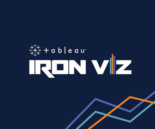
We are just weeks away from Tableau Conference and the ultimate visualization showdown —Iron Viz 2021—where three fierce contestants will take the virtual stage for an intense lightning round of live viz-tastic storytelling. . Participating has always pushed my datavisualization skills to be greater. Ateken Abla.
We are just weeks away from Tableau Conference and the ultimate visualization showdown —Iron Viz 2021—where three fierce contestants will take the virtual stage for an intense lightning round of live viz-tastic storytelling. . Participating has always pushed my datavisualization skills to be greater. Ateken Abla.
Tableau lets you visualize and explore all of your data without having to write code or premeditate your vizzes and dashboards. We also reached some incredible milestones with Tableau Prep, our easy-to-use, visual, self-service data prep product. Read the 2021 report for Gartner analysis.
ElegantJ BI , an innovative vendor in Business Intelligence and Augmented Analytics, is pleased to announce that ElegantJ BI is named as Representative Vendors in the Gartner ‘ Market Guide for Traditional Enterprise Reporting Platforms ‘ report published September 28, 2017. Sallam, Nigel Shen.
ElegantJ BI , an innovative vendor in Business Intelligence and Augmented Analytics, is pleased to announce that ElegantJ BI is named as Representative Vendors in the Gartner ‘ Market Guide for Traditional Enterprise Reporting Platforms ‘ report published September 28, 2017. Sallam, Nigel Shen.
ElegantJ BI , an innovative vendor in Business Intelligence and Augmented Analytics, is pleased to announce that ElegantJ BI is named as Representative Vendors in the Gartner ‘ Market Guide for Traditional Enterprise Reporting Platforms ‘ report published September 28, 2017. Sallam, Nigel Shen.
Click to view the full interactive visualization. VizQL: A domain-specific language for visual, self-service analysis. The core innovation in Chris’ prototype was a domain-specific language called VizQL that combined query and visual encoding of data. The Cycle of Visual Analysis. Release v1.0
Data exploded and became big. Spreadsheets finally took a backseat to actionable and insightful datavisualizations and interactive business dashboards. The rise of self-service analytics democratized the data product chain. 2) Data Discovery/Visualization. We all gained access to the cloud.
We organize all of the trending information in your field so you don't have to. Join 57,000+ users and stay up to date on the latest articles your peers are reading.
You know about us, now we want to get to know you!
Let's personalize your content
Let's get even more personalized
We recognize your account from another site in our network, please click 'Send Email' below to continue with verifying your account and setting a password.


Let's personalize your content