Remove 2014 Remove 2019 Remove Visualization
article thumbnail

5 Ingenious Tips For A Promising Big Data Career

Smart Data Collective

Analysts have found that the market for big data jobs increased 23% between 2014 and 2019. Big data has been billed as being the future of business for quite some time. However, the future is now. The market for Hadoop jobs increased 58% in that timeframe. The impact of big data is felt across all sectors of the economy.

Big Data 203
article thumbnail

Euro Soccer Special: What Football Teaches Us About Analytics

Sisense

Heat map data visualizations have shown teams that keep possession of the ball and maintain high intensity are most likely to score goals and win games. On 8 July 2014, Brazil suffered its worst ever defeat at the hands of Germany, losing 7-1 in the World Cup semifinal. Heat Map: Robert Lewandowski, Bayern Munich, 2019/2020 season.

Insiders

Sign Up for our Newsletter

This site is protected by reCAPTCHA and the Google Privacy Policy and Terms of Service apply.

article thumbnail

How The Cloud Made ‘Data-Driven Culture’ Possible | Part 1

BizAcuity

2014: Satya Nadella, who is influential behind Microsoft’s cloud market ventures, becomes the CEO of Microsoft. Microsoft also releases Power BI, a data visualization and business intelligence tool. 2019: Hybrid cloud strategy starts to trend. Fact: IBM built the world’s first data warehouse in the 1980’s.

IBM cost 130
article thumbnail

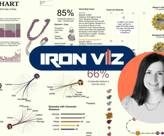
Meet Iron Viz 2024 Finalist Jessica Moon

Tableau

Hunting for a job in contracts after giving birth to her first child, an opportunity arose to test data visualizations produced by a team using Tableau. By 2014, Jessica was a full-time Tableau viz tester. “As I particularly enjoy B2VB–Back to Viz Basics –because they focus on just one element of visualization.

article thumbnail

Top Challenges and Opportunities for Chief Data Officers

Sisense

In fact, in a 2019 edition of Industrial Management & Data Systems, a research team led by Yu Nie noted that prior to the year 2000, there were only six chief data officers in the world. The role is a relative newcomer to the boardroom.

article thumbnail

Discover 20 Essential Types Of Graphs And Charts And When To Use Them

Data Pine

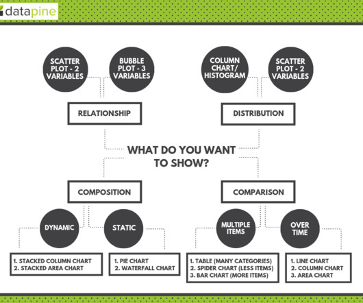
That said, there is still a lack of charting literacy due to the wide range of visuals available to us and the misuse of statistics. In many cases, even the chart designers are not picking the right visuals to convey the information in the correct way. Let’s dive into them.

article thumbnail

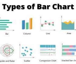
What Is A Bar Chart And What Are The Types Of Bar Chart?

The BAWorld

This vertical bar chart shows the Sales Vs. Target (sales minus target) nominal data plotted across months from 2010 – 2014. We can see that October 2013 has the lowest target deficit for office supplies while August 2014 has the highest sales surplus compared to its pre-decided target. Stacked Bar Charts. Clustered Charts.