This site uses cookies to improve your experience. To help us insure we adhere to various privacy regulations, please select your country/region of residence. If you do not select a country, we will assume you are from the United States. Select your Cookie Settings or view our Privacy Policy and Terms of Use.
Cookie Settings
Cookies and similar technologies are used on this website for proper function of the website, for tracking performance analytics and for marketing purposes. We and some of our third-party providers may use cookie data for various purposes. Please review the cookie settings below and choose your preference.
Used for the proper function of the website
Used for monitoring website traffic and interactions
Cookie Settings
Cookies and similar technologies are used on this website for proper function of the website, for tracking performance analytics and for marketing purposes. We and some of our third-party providers may use cookie data for various purposes. Please review the cookie settings below and choose your preference.
Strictly Necessary: Used for the proper function of the website
Performance/Analytics: Used for monitoring website traffic and interactions
Alberto Cairo, datavisualization expert and author of How Charts Lie Whether you are reading a social post, news article or business report, it’s important to know and evaluate the source of the data and charts that you view. DataVisualization expert and author Kathy Rowell says that we should always ask “Compared to What?”,
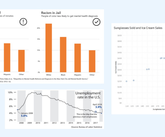
The key is to think critically and take time to evaluate the interpretations of data portrayed in charts. DataVisualization expert and author Kathy Rowell says that we should always ask “Compared to What?” Unemployment rate shown over multiple years, showing a downward overall trend from 2009 to 2018.
A 2009 investigative survey by Dr. Daniele Fanelli from The University of Edinburgh found that 33.7% of scientists surveyed admitted to questionable research practices, including modifying results to improve outcomes, subjective data interpretation, withholding analytical details, and dropping observations because of gut feelings….
We organize all of the trending information in your field so you don't have to. Join 57,000+ users and stay up to date on the latest articles your peers are reading.
You know about us, now we want to get to know you!
Let's personalize your content
Let's get even more personalized
We recognize your account from another site in our network, please click 'Send Email' below to continue with verifying your account and setting a password.


Let's personalize your content