Remove 2009 Remove 2020 Remove Visualization
article thumbnail

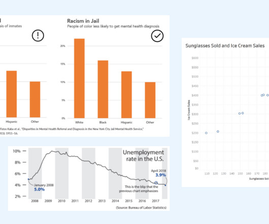
How to Spot Misleading Charts, a Checklist

Tableau

Alberto Cairo, data visualization expert and author of How Charts Lie Whether you are reading a social post, news article or business report, it’s important to know and evaluate the source of the data and charts that you view. Data Visualization expert and author Kathy Rowell says that we should always ask “Compared to What?”,

article thumbnail

How The Cloud Made ‘Data-Driven Culture’ Possible | Part 1

BizAcuity

14 years later, in 2020, the pandemic demands for remote work, and overnight revisions to business strategy. 2009: Amazon releases its own Relational Database Services on cloud to simplify set up and operations. Microsoft also releases Power BI, a data visualization and business intelligence tool. The rest is history.

IBM cost 130
Insiders

Sign Up for our Newsletter

This site is protected by reCAPTCHA and the Google Privacy Policy and Terms of Service apply.

article thumbnail

How To Spot Misleading Charts: Review the Message

Tableau

Data Visualization expert and author Kathy Rowell says that we should always ask “Compared to What?” For example, in How Charts Lie: Getting Smarter about Visual Information , Alberto Cairo discusses the following bar chart. Unemployment rate shown over multiple years, showing a downward overall trend from 2009 to 2018.

article thumbnail

Analyzing the history of Tableau innovation

Tableau

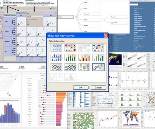
Click to view the full interactive visualization. VizQL: A domain-specific language for visual, self-service analysis. The core innovation in Chris’ prototype was a domain-specific language called VizQL that combined query and visual encoding of data. The Cycle of Visual Analysis. Release v1.0

article thumbnail

Why companies must close the data literacy divide

Domo

Similarly, all of the rich data visualizations and intelligence built into today’s self-service analytics tools can be negated by a simple deficiency in data literacy, which can be defined as the ability to understand, use and communicate data effectively. How valuable would it be to someone who is illiterate?

article thumbnail

Misleading Statistics Examples – Discover The Potential For Misuse of Statistics & Data In The Digital Age

Data Pine

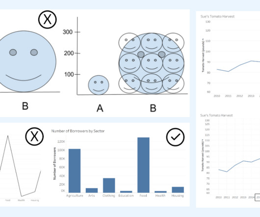
A 2009 investigative survey by Dr. Daniele Fanelli from The University of Edinburgh found that 33.7% With the COVID-19 pandemic, the general public was forced to consume scientific information in the form of data visualizations to stay informed about the current developments of the virus. 4) Misleading data visualization.

Digital 145