Remove 2009 Remove 2018 Remove Data Visualization
article thumbnail

How to Spot Misleading Charts, a Checklist

Tableau

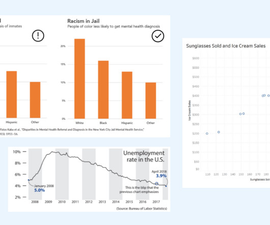
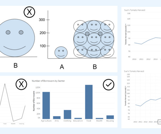
Alberto Cairo, data visualization expert and author of How Charts Lie Whether you are reading a social post, news article or business report, it’s important to know and evaluate the source of the data and charts that you view. Two line graphs showing the same data with different intervals on the axis. Know the Source.

article thumbnail

How The Cloud Made ‘Data-Driven Culture’ Possible | Part 1

BizAcuity

2009: Amazon releases its own Relational Database Services on cloud to simplify set up and operations. Microsoft also releases Power BI, a data visualization and business intelligence tool. 2018: IoT and edge computing open up new opportunities for organizations. As a result, AWS witnessed rapid adoptions in the market.

IBM cost 130
Insiders

Sign Up for our Newsletter

This site is protected by reCAPTCHA and the Google Privacy Policy and Terms of Service apply.

article thumbnail

What is Area Chart – A Complete Guide for Beginners

The BAWorld

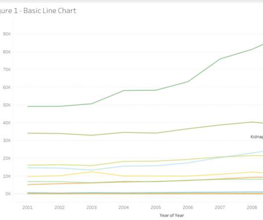
We can quickly tell that the crime rates for Cruelty by Husband and Relatives increased significantly from 2008 to 2009 compared to others. Let us look at another example data set, which contains data about arrival and departure domestic and international passenger traffic from various terminals from the LA airport from 2006 to 2018.

article thumbnail

How To Spot Misleading Charts: Review the Message

Tableau

The key is to think critically and take time to evaluate the interpretations of data portrayed in charts. Data Visualization expert and author Kathy Rowell says that we should always ask “Compared to What?” Unemployment rate shown over multiple years, showing a downward overall trend from 2009 to 2018.

article thumbnail

The Importance Of Financial Reporting And Analysis: Your Essential Guide

Data Pine

firm Kraft, in 2009, it reported IFRS-based profits of $690 million. The post The Importance Of Financial Reporting And Analysis: Your Essential Guide appeared first on BI Blog | Data Visualization & Analytics Blog | datapine. These fluctuations in standardization have real-world consequences.

article thumbnail

Analyzing the history of Tableau innovation

Tableau

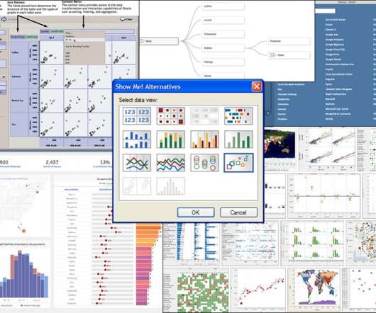
Working with multiple tables got a significant boost with cross data source actions in v5.0 (May The Data Tab was integrated with the connection experience and supported the scenario of adding additional data sources during exploration. Another key data computation moment was Hyper in v10.5 (Jan