Remove 2006 Remove Data Visualization Remove Visualization
article thumbnail

The Perceptual and Cognitive Limits of Multivariate Data Visualization

Perceptual Edge

Almost all data visualizations are multivariate (i.e., Three graphical approaches are currently available for displaying multiple variables: Encode each variable using a different visual attribute. Encode every variable using the same visual attribute. Encode Each Variable Using a Different Visual Attribute.

article thumbnail

How The Cloud Made ‘Data-Driven Culture’ Possible | Part 1

BizAcuity

2006: Amazon spearheads the cloud initiative, drops EC2 and S3 into the market. 2007: Amazon launches SimpleDB, a non-relational (NoSQL) database that allows businesses to cheaply process vast amounts of data with minimal effort. Hadoop was developed in 2006. Amazon launches AWS (but no cloud solutions yet). The pain point?

IBM cost 130
Insiders

Sign Up for our Newsletter

This site is protected by reCAPTCHA and the Google Privacy Policy and Terms of Service apply.

article thumbnail

What is Area Chart – A Complete Guide for Beginners

The BAWorld

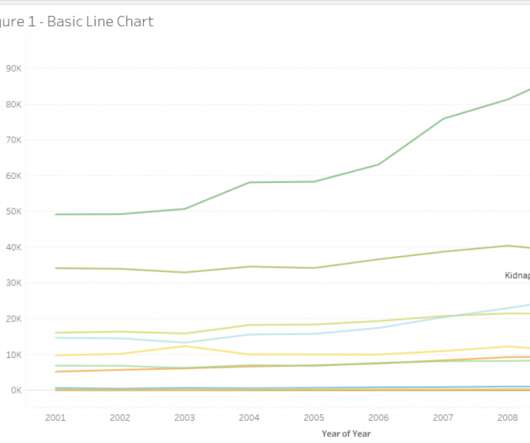
Line charts are usually required for comparisons or visualizing trends between data points. Let us look at another example data set, which contains data about arrival and departure domestic and international passenger traffic from various terminals from the LA airport from 2006 to 2018. The implication of figure 2.

article thumbnail

Analyzing the history of Tableau innovation

Tableau

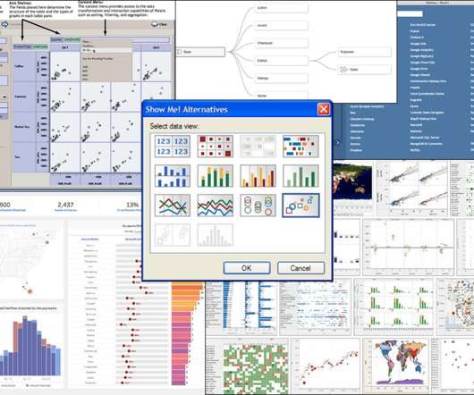
Click to view the full interactive visualization. VizQL: A domain-specific language for visual, self-service analysis. The core innovation in Chris’ prototype was a domain-specific language called VizQL that combined query and visual encoding of data. The Cycle of Visual Analysis. Release v1.0

article thumbnail

Misleading Statistics Examples – Discover The Potential For Misuse of Statistics & Data In The Digital Age

Data Pine

Based on the structure of the chart, it does in fact appear to show that the number of abortions since 2006 experienced substantial growth, while the number of cancer screenings substantially decreased. Here they speak about two use-cases in which COVID-19 data was used in a misleading way. 4) Misleading data visualization.

Digital 145